DESIGN PORTFOLIO '26
Nike: EKIN U · Iya · Rooted · Vivid Expressions · SVA Grads '24 · Adidas x St. John's · Seguro
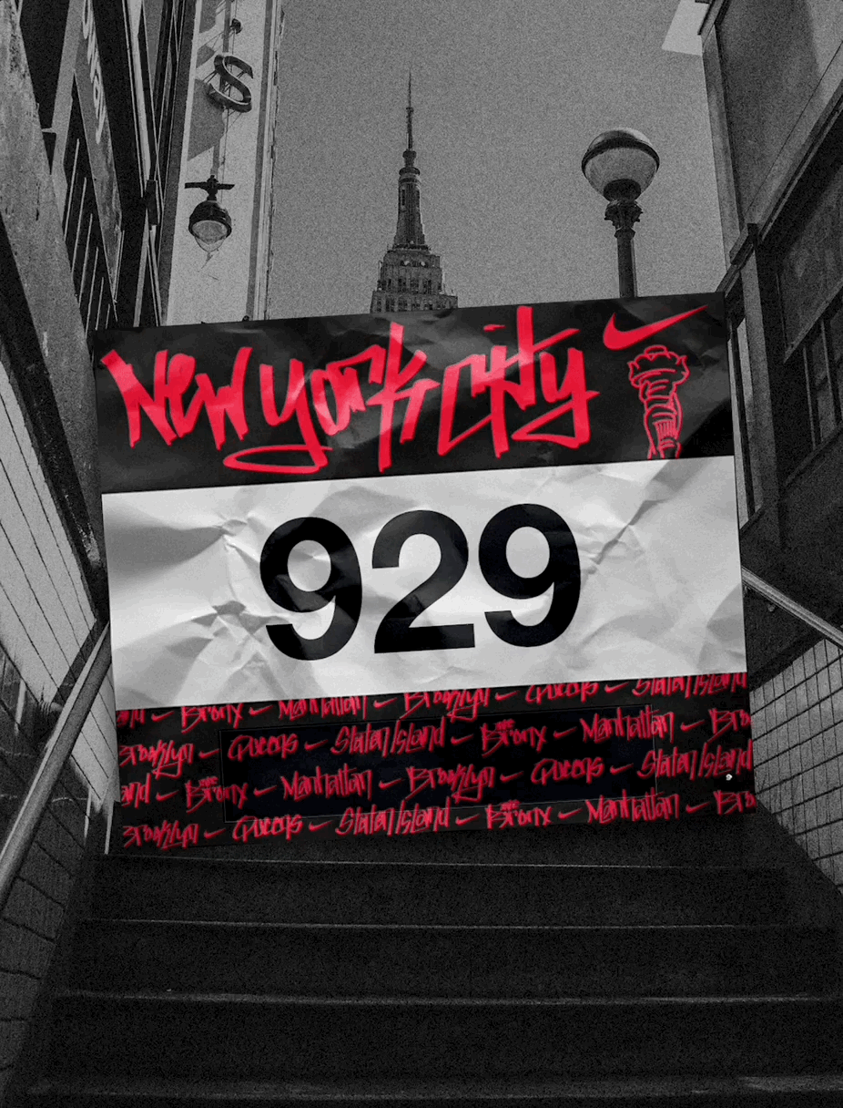
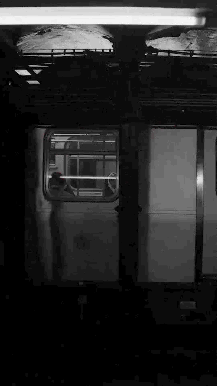
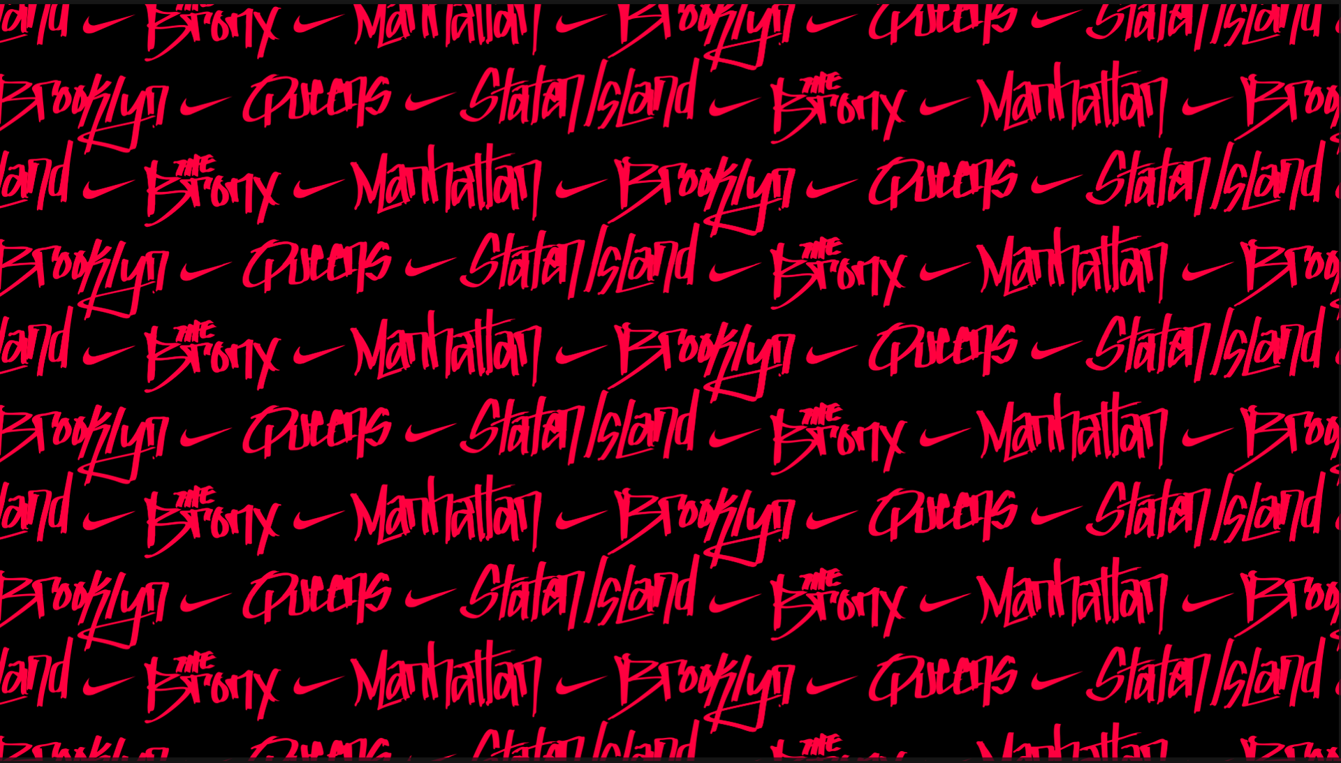
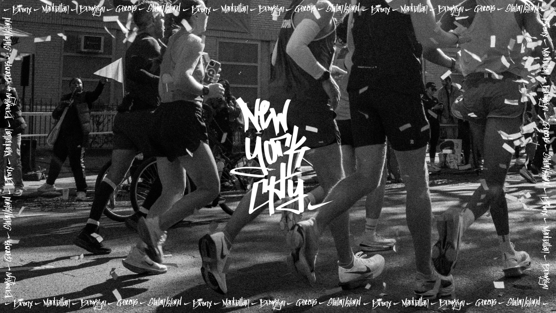
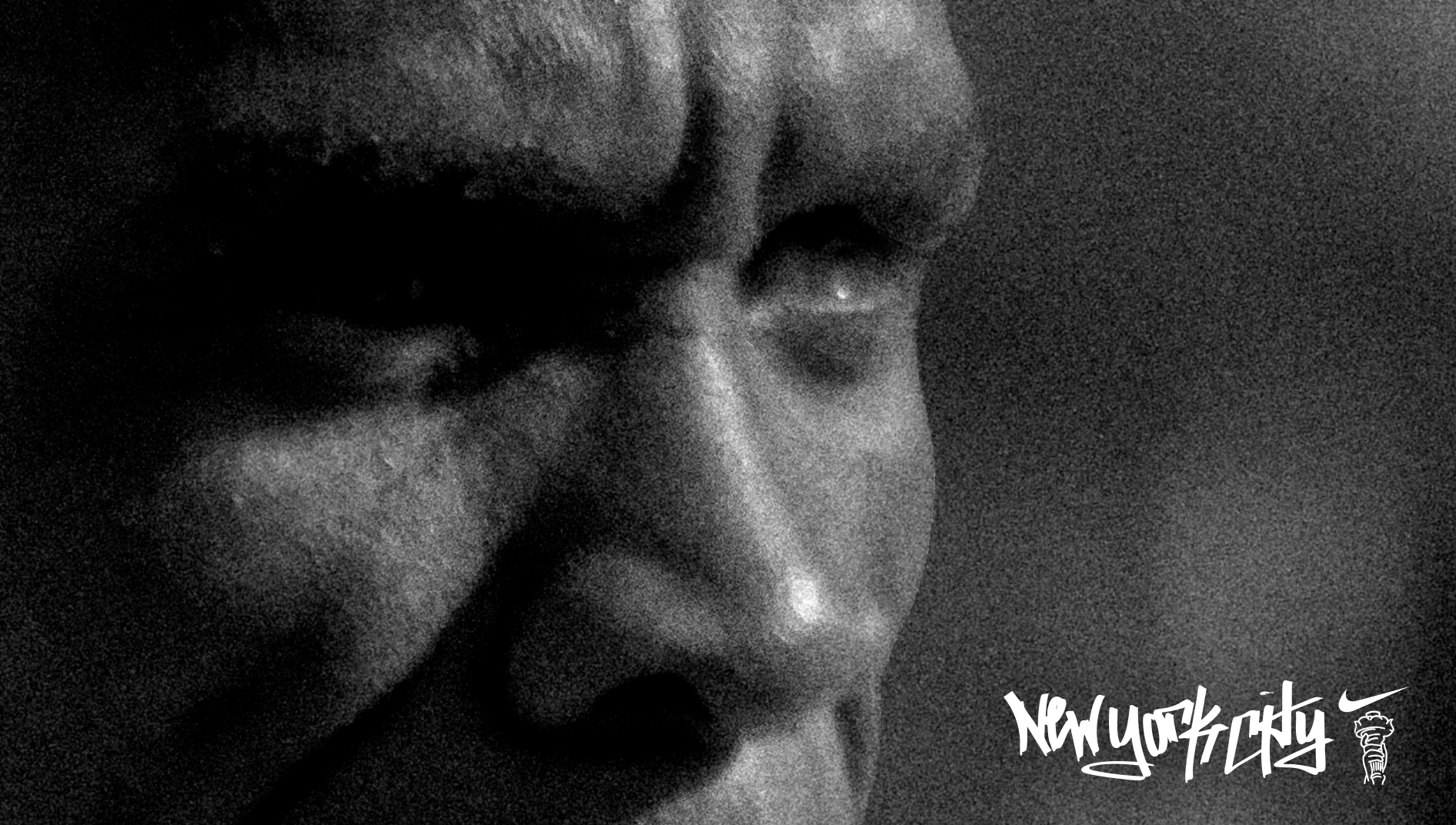
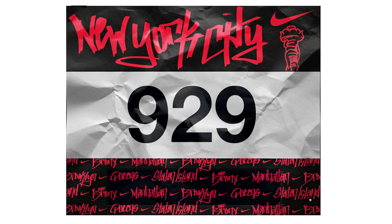
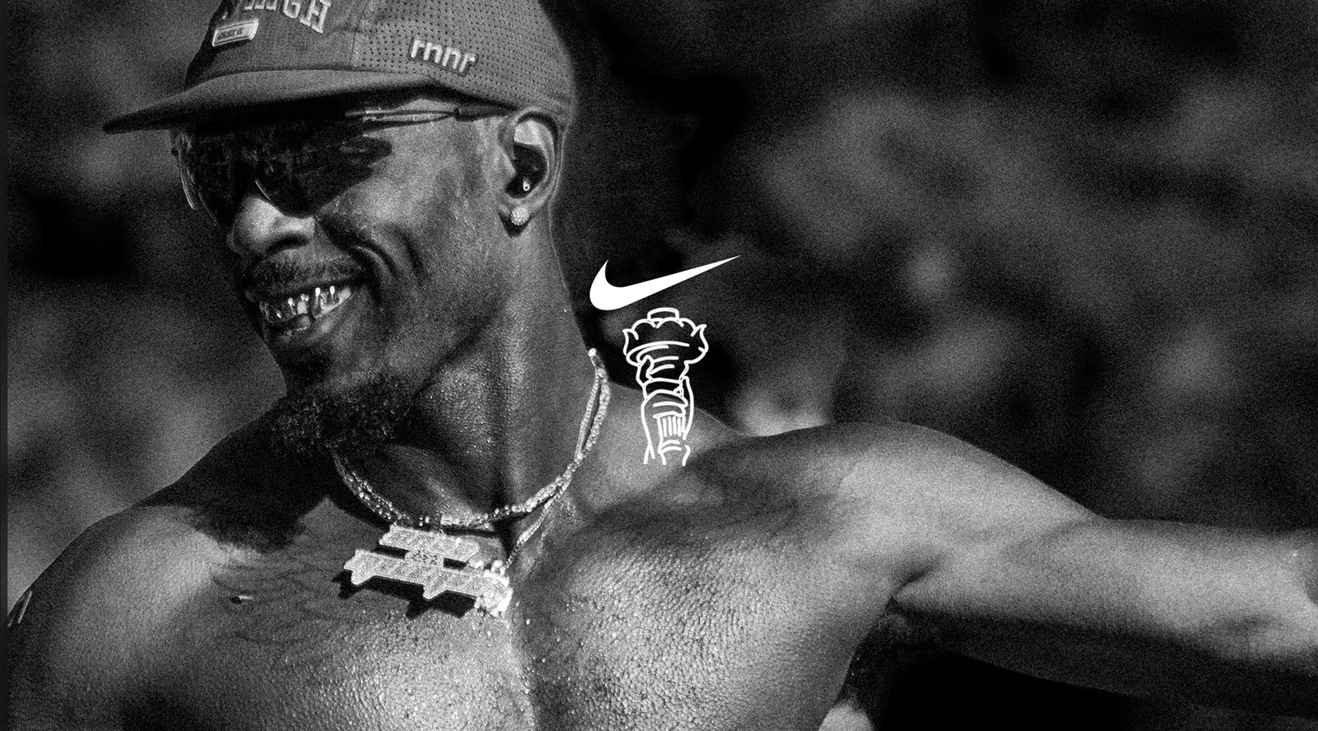
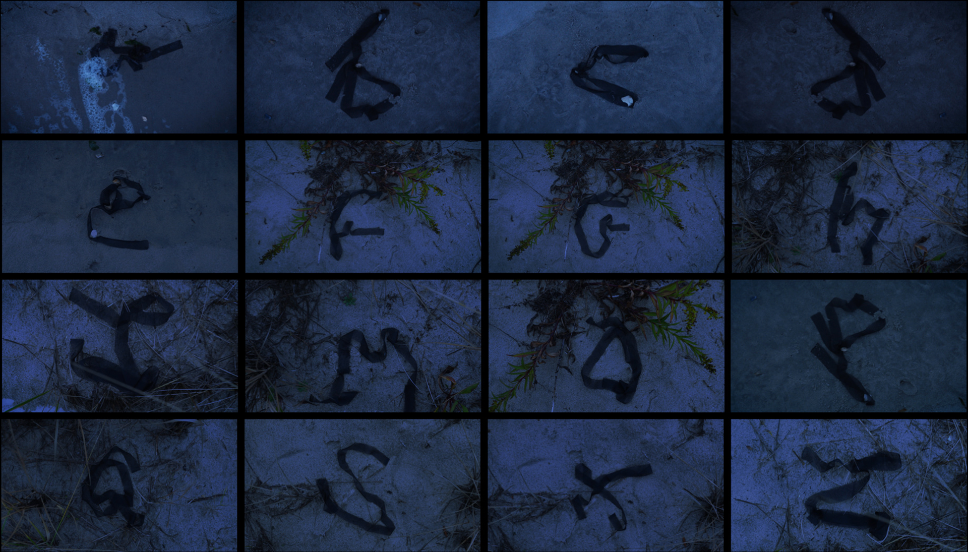
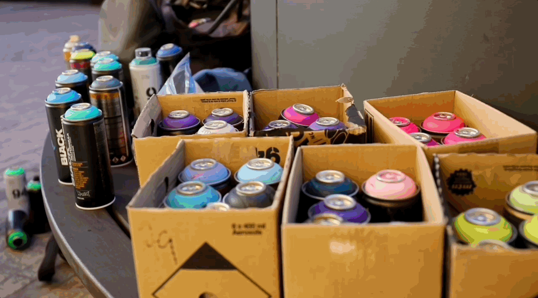
Every year the EKINs host a long distance relay in the heart of NYC. This time they wanted a new bib design that brings the culture of NYC to life. This custom/hand-drawn typeface highlights the beauty in graffiti culture and what that looks like in NYC. To further bring this typeface to life, I paired it with a social post using photos (shot by me) of the NYC Marathon '25.

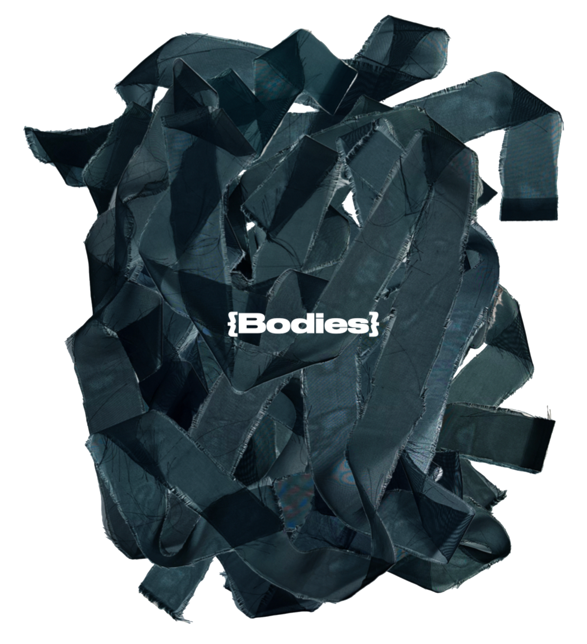
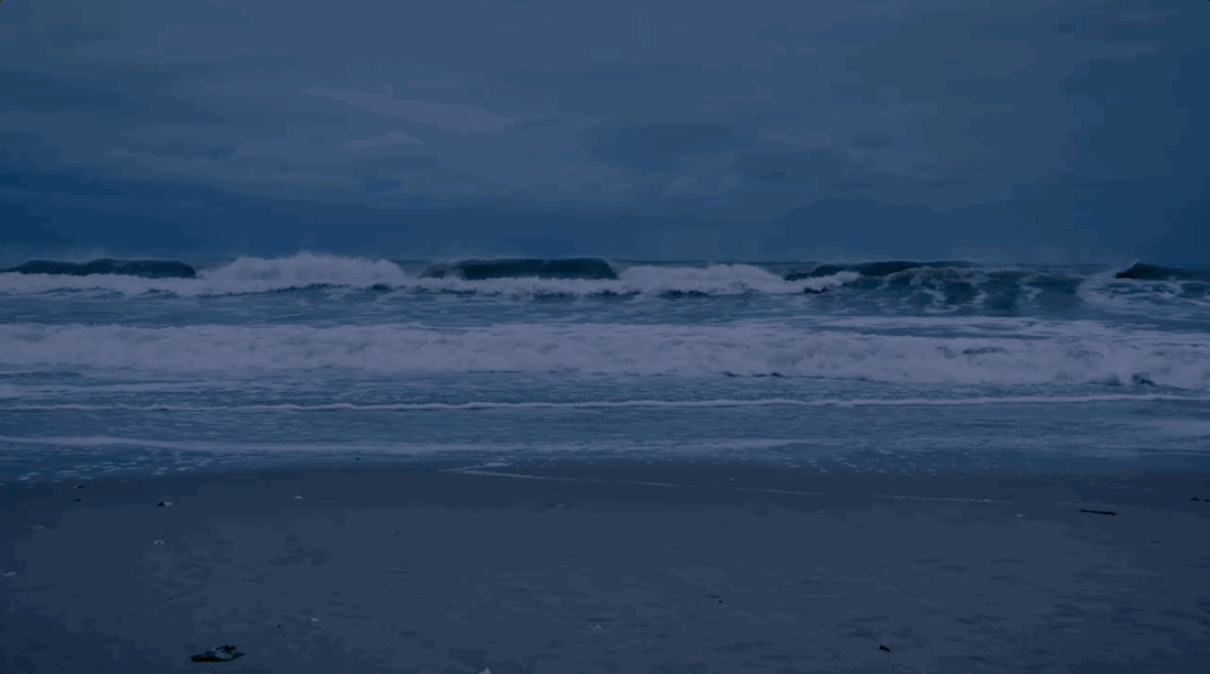
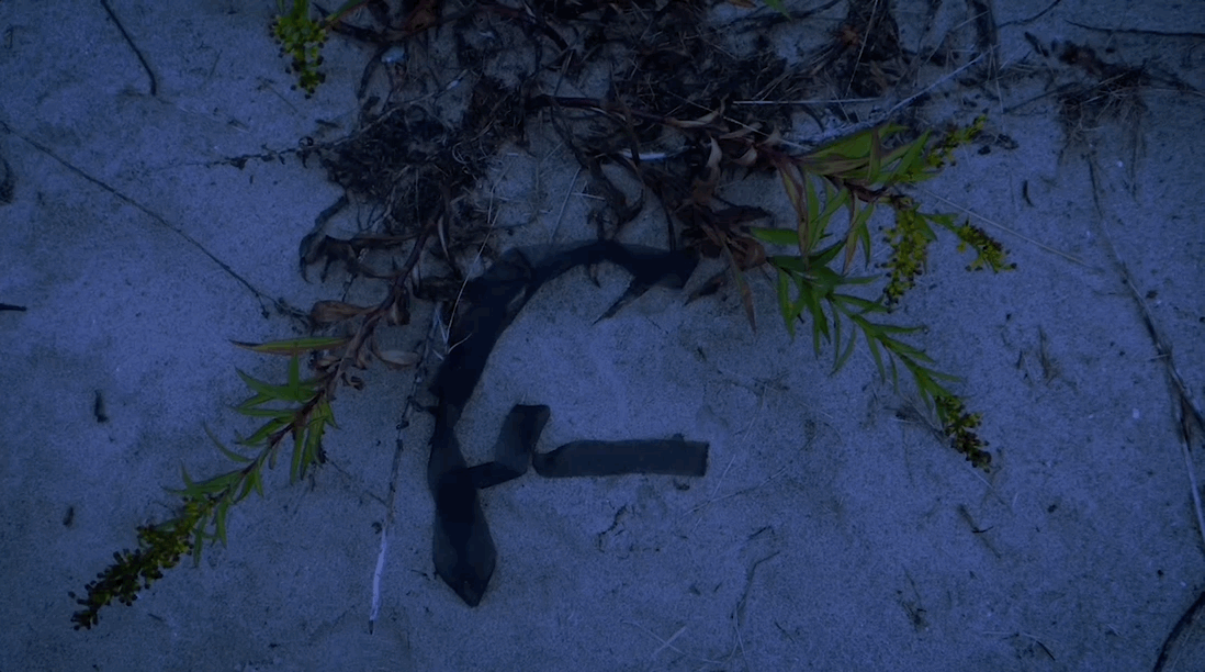
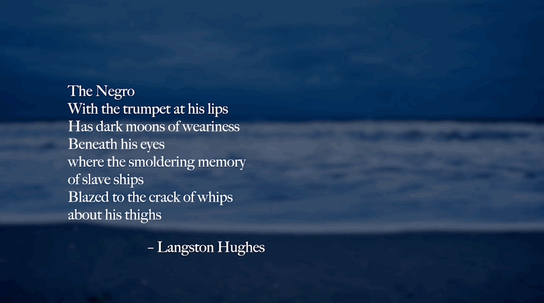
This typeface expresses the ocean’s anger towards the 1.8 million enslaved men and women that died during the transatlantic slave trade. “Iya” meaning mother in Yoruba is a love letter to all the enslaved women whom should have brought life to the world but tragically died.

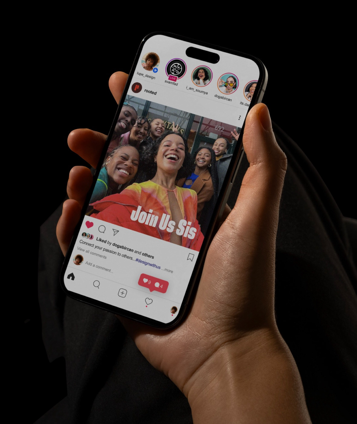
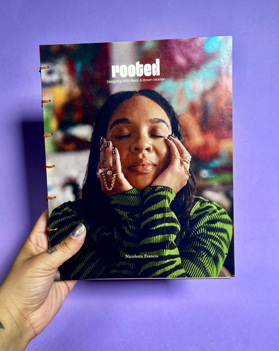
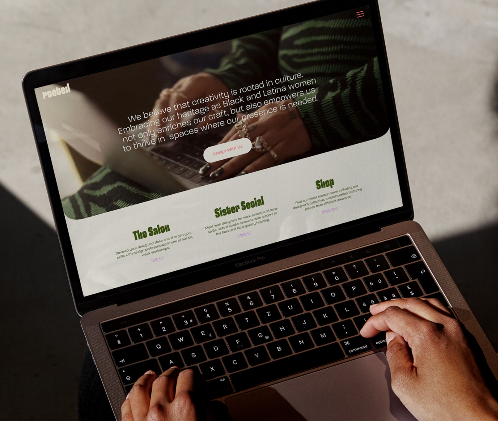
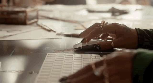
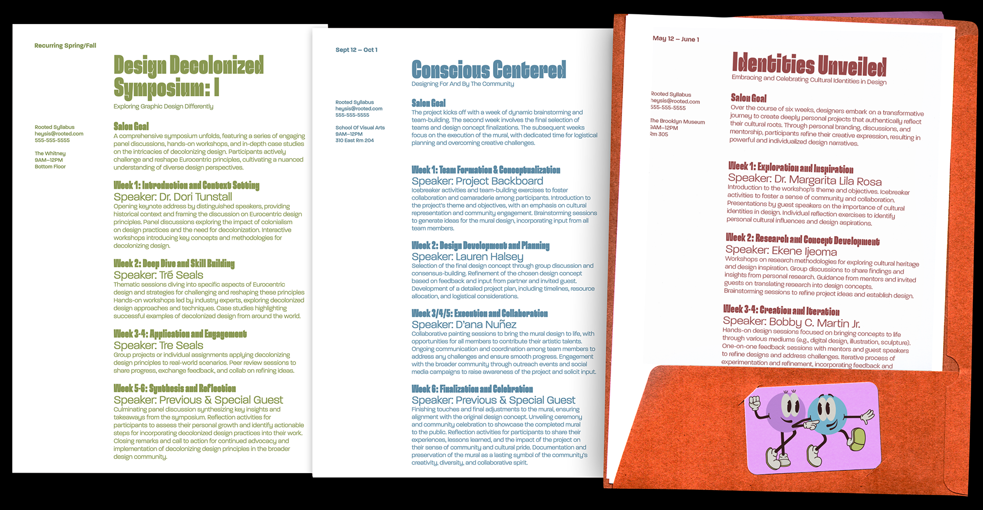
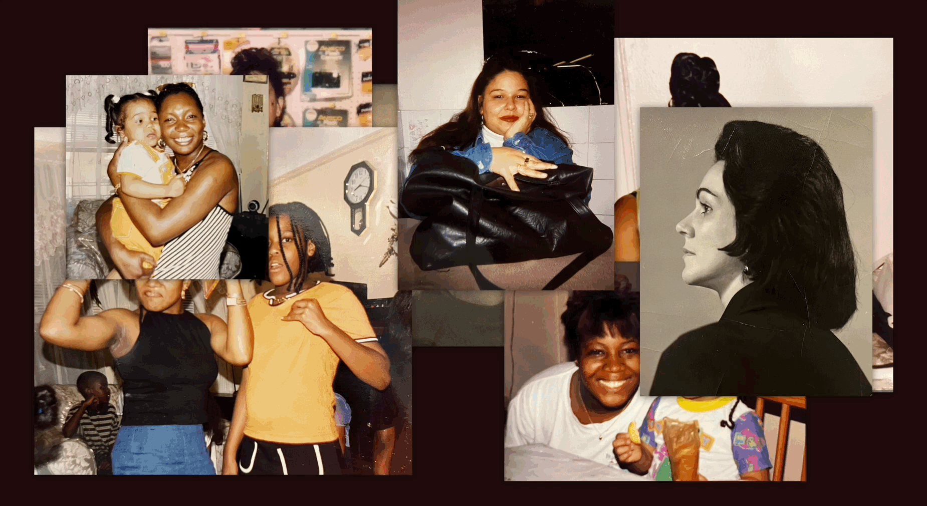
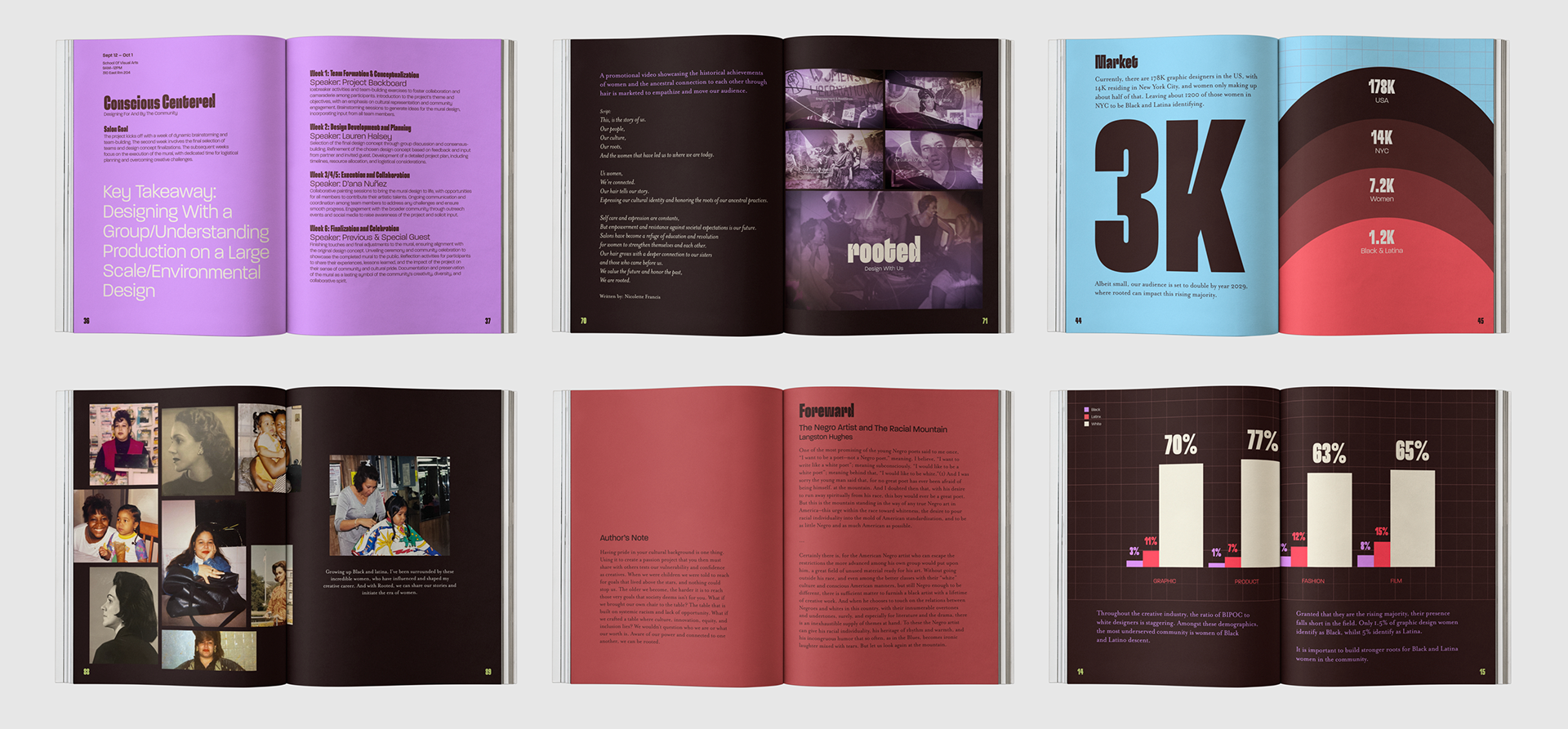
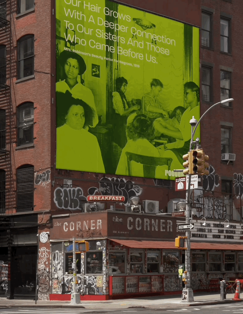
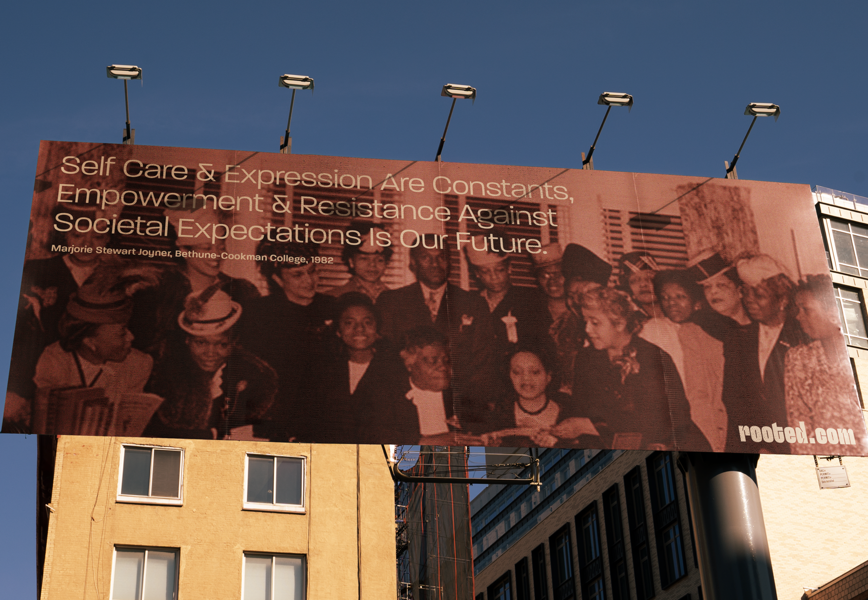
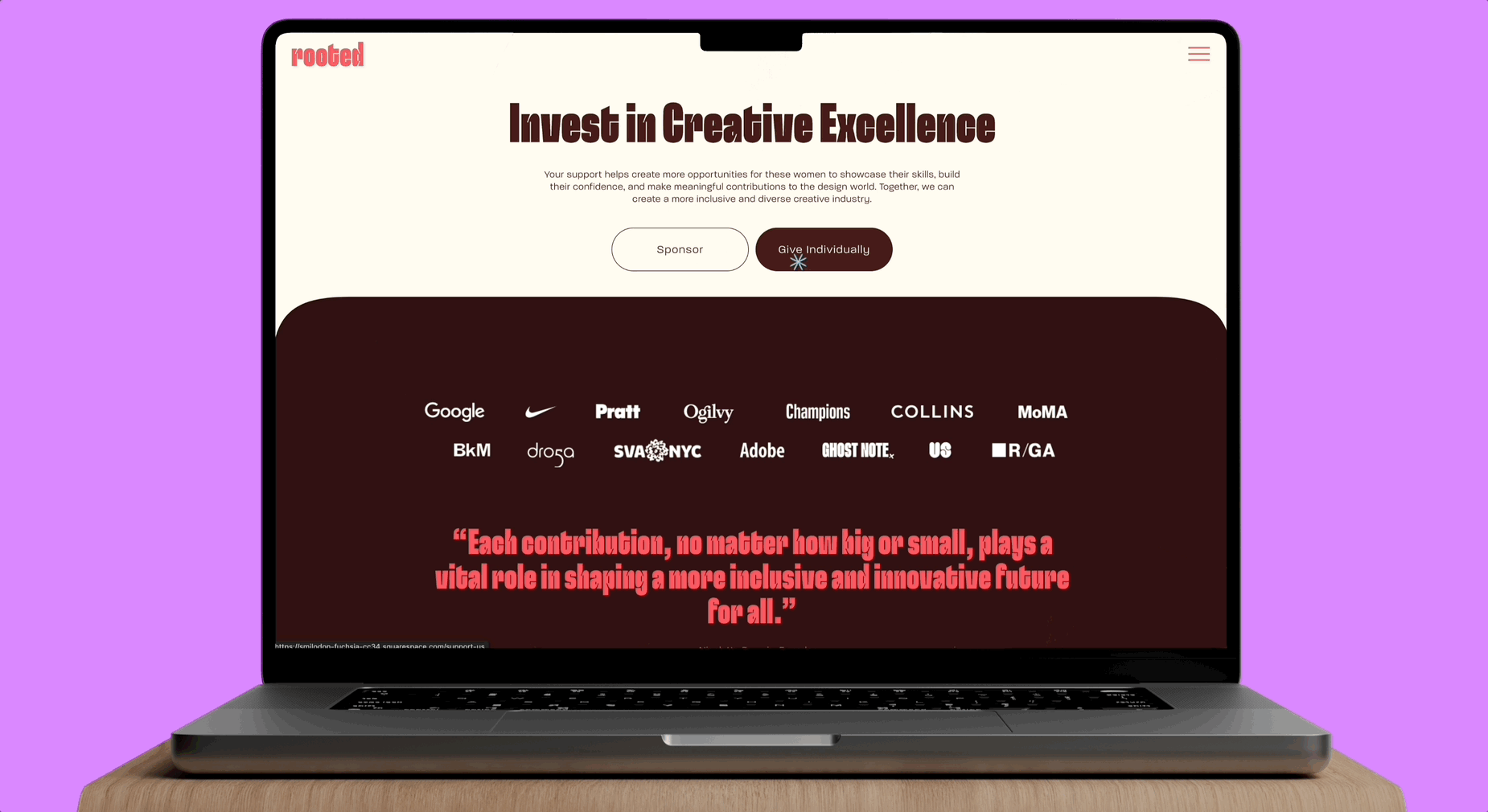
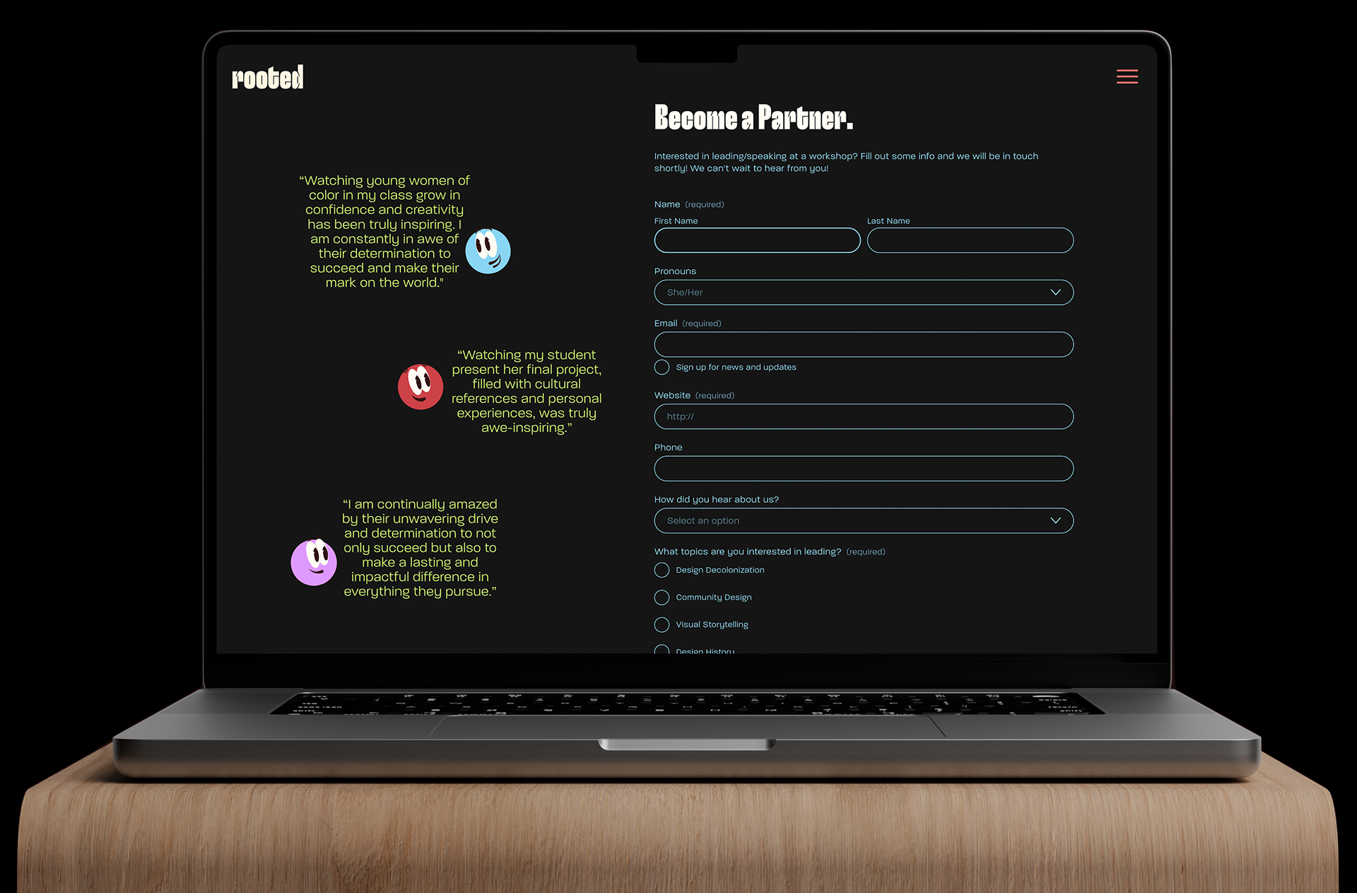
ROOTED
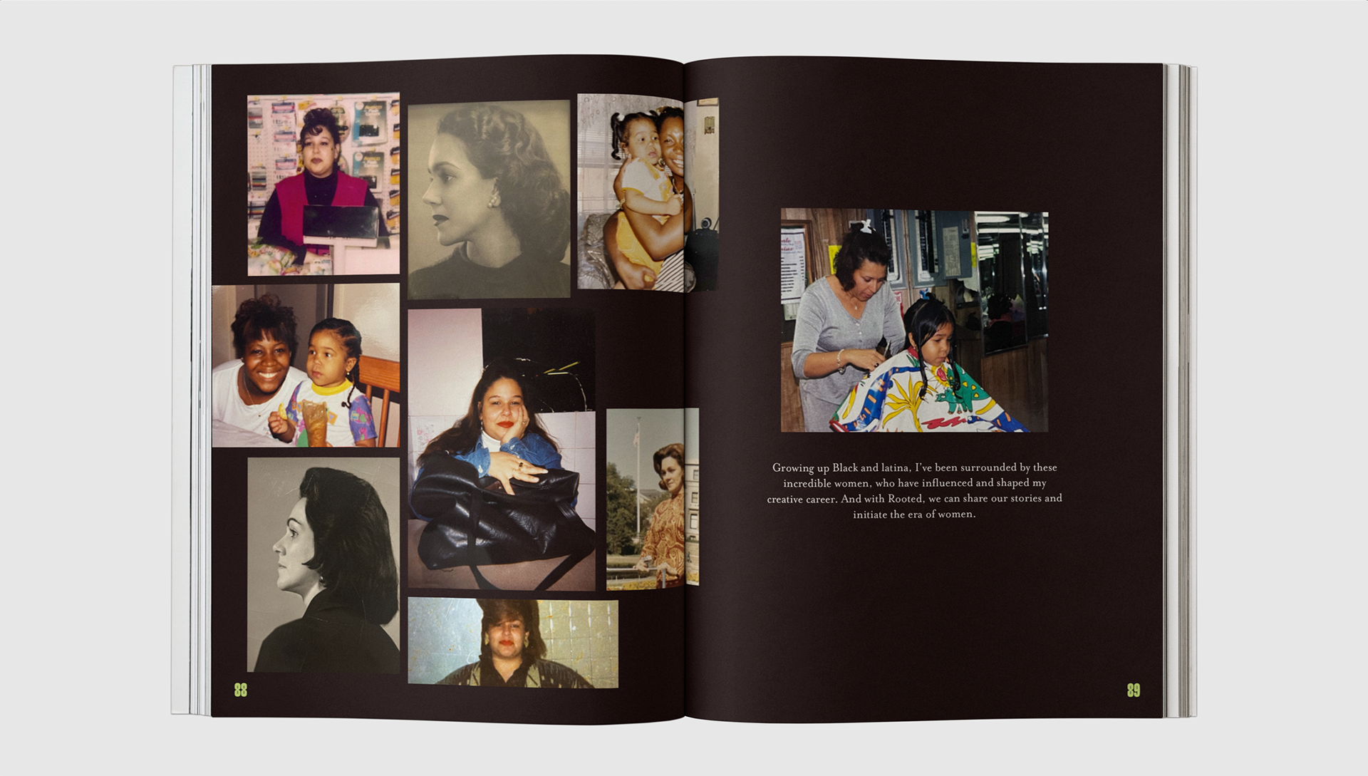
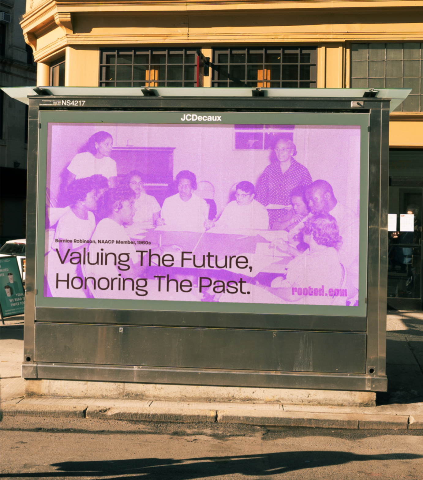
For generations, women of color have found support, creativity, and sisterhood in community spaces like salons. In the 1950s, Bernice Robinson redefined the salon as a hub for activism, education, and empowerment. Today, salons continue to be spaces for self-expression and connection.
Rooted is inspired by this legacy. We are a creative community that nurtures Black and Latina graphic designers, promoting culture, growth, and innovation. Rooted empowers women to design beyond Eurocentric norms and embrace the richness of their heritage.
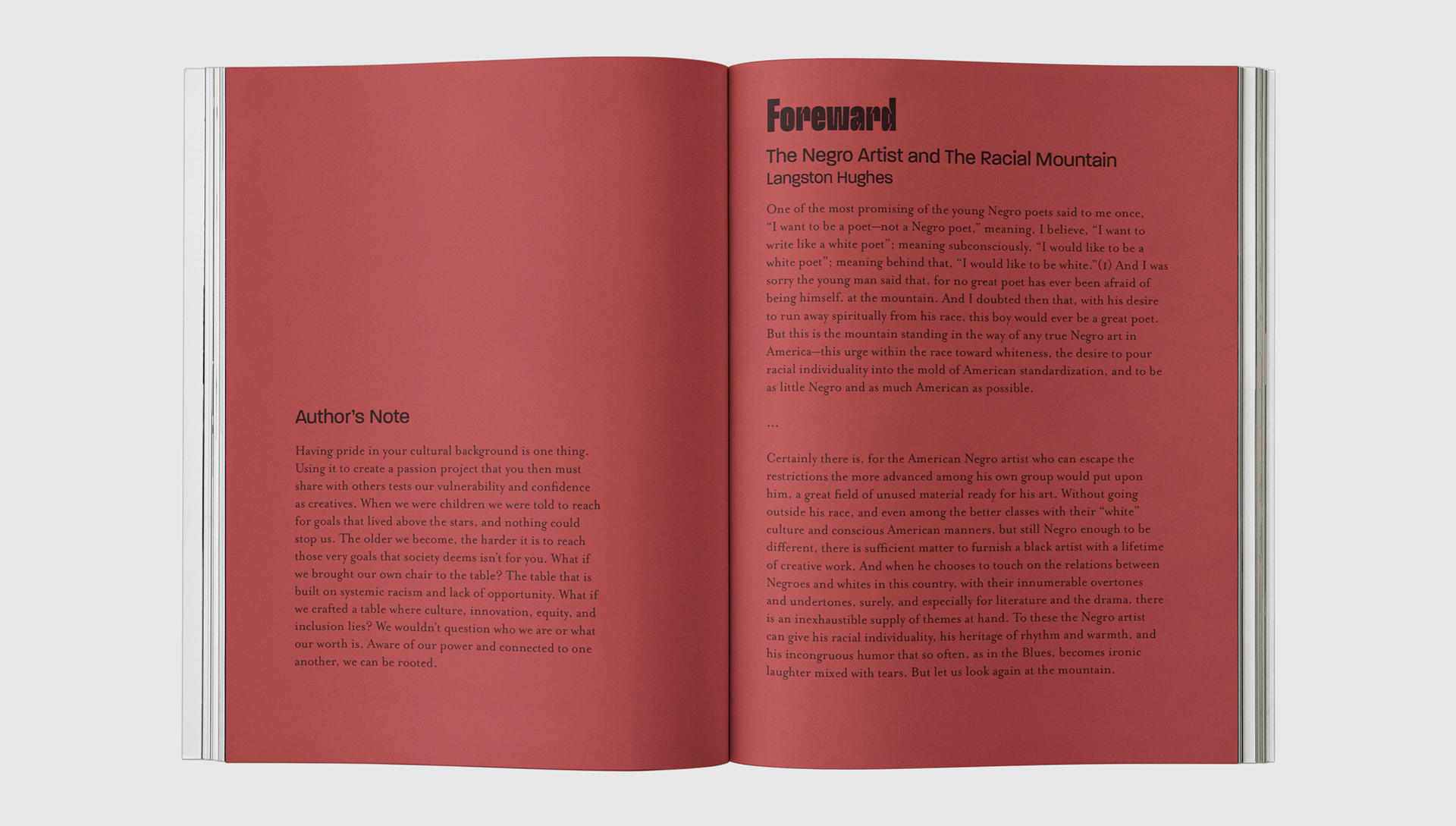
As a designer navigating a predominantly white industry, I struggled with identity and belonging. Rooted was born from this challenge—a space where our voices and creativity are seen, heard, and celebrated.

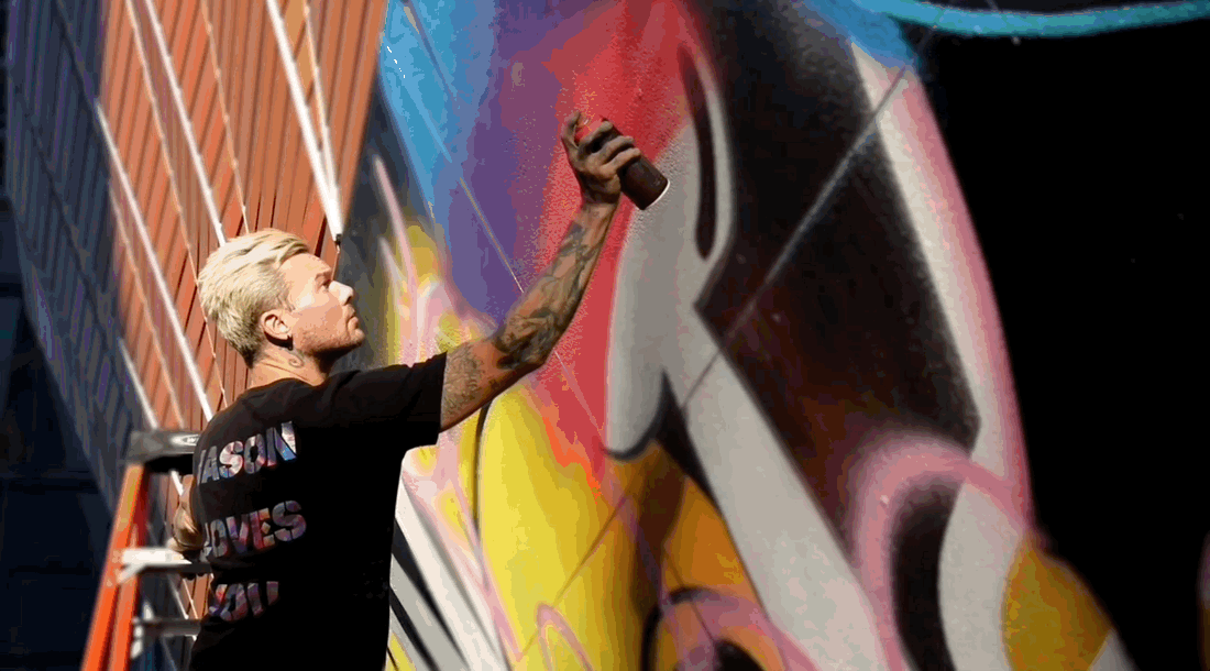
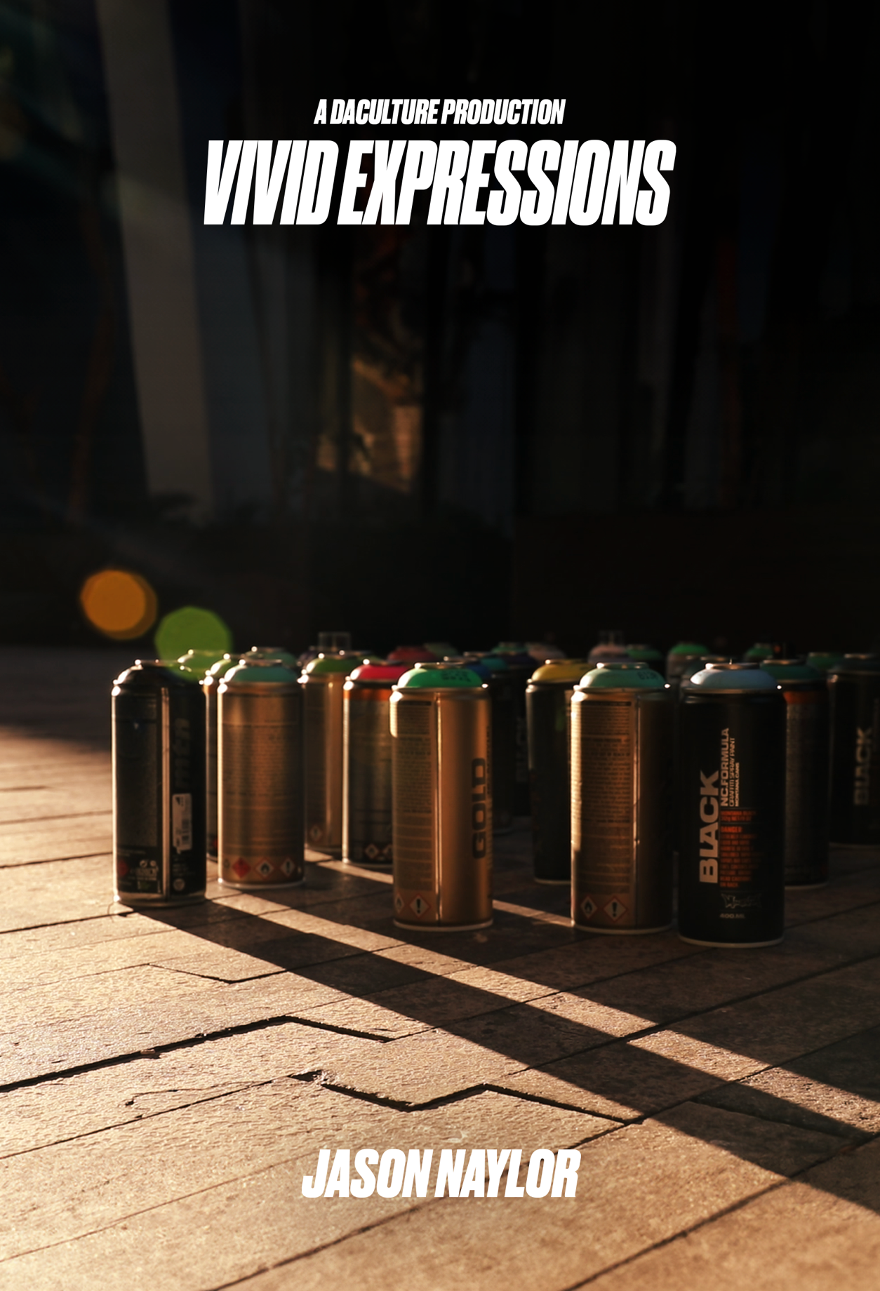
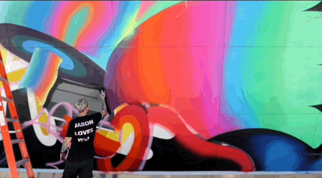
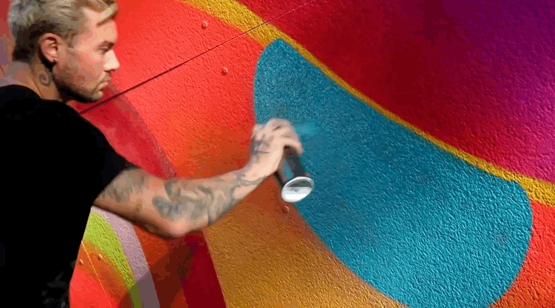
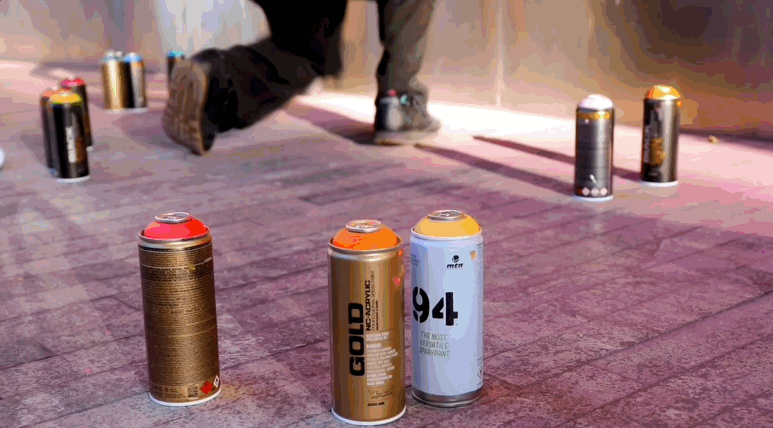
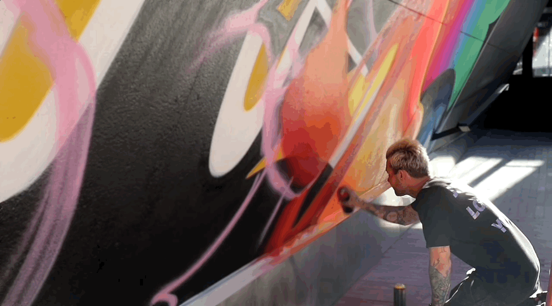
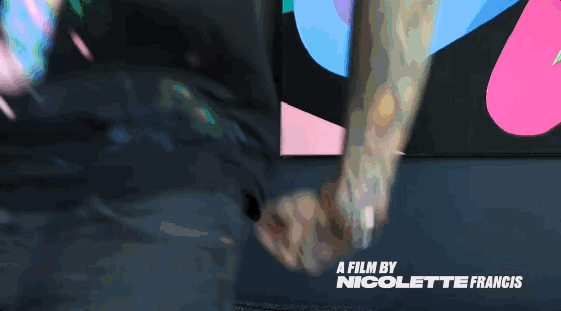
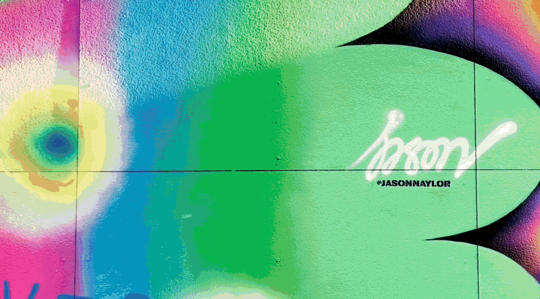
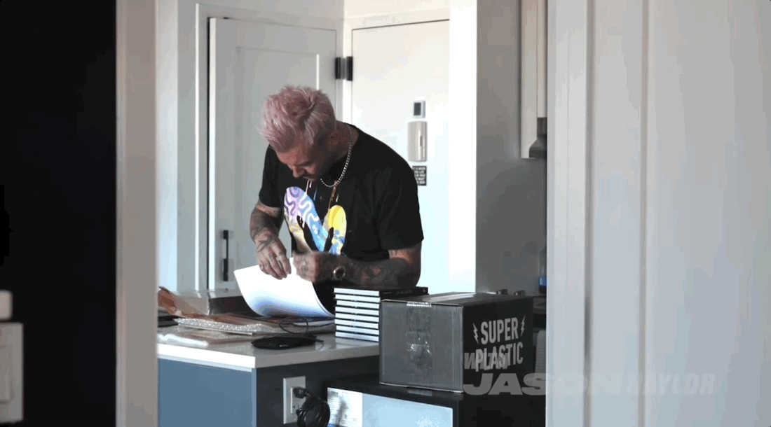
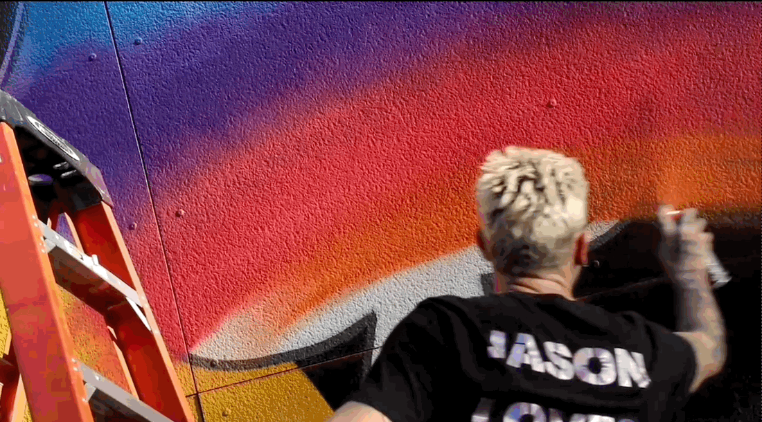
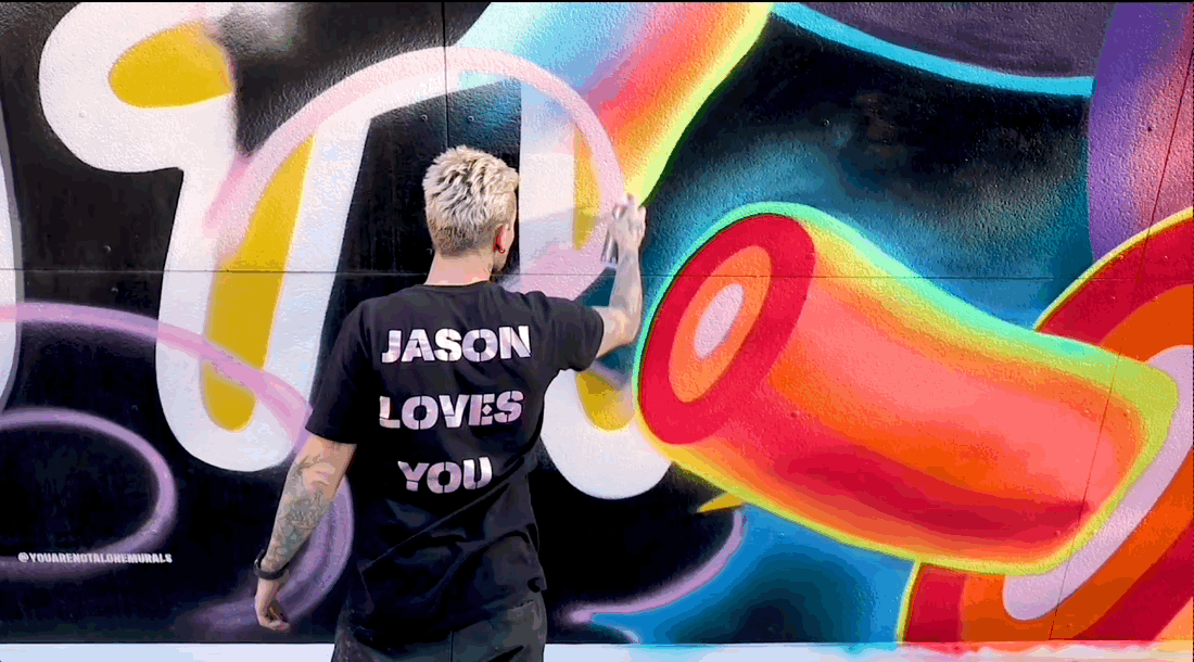
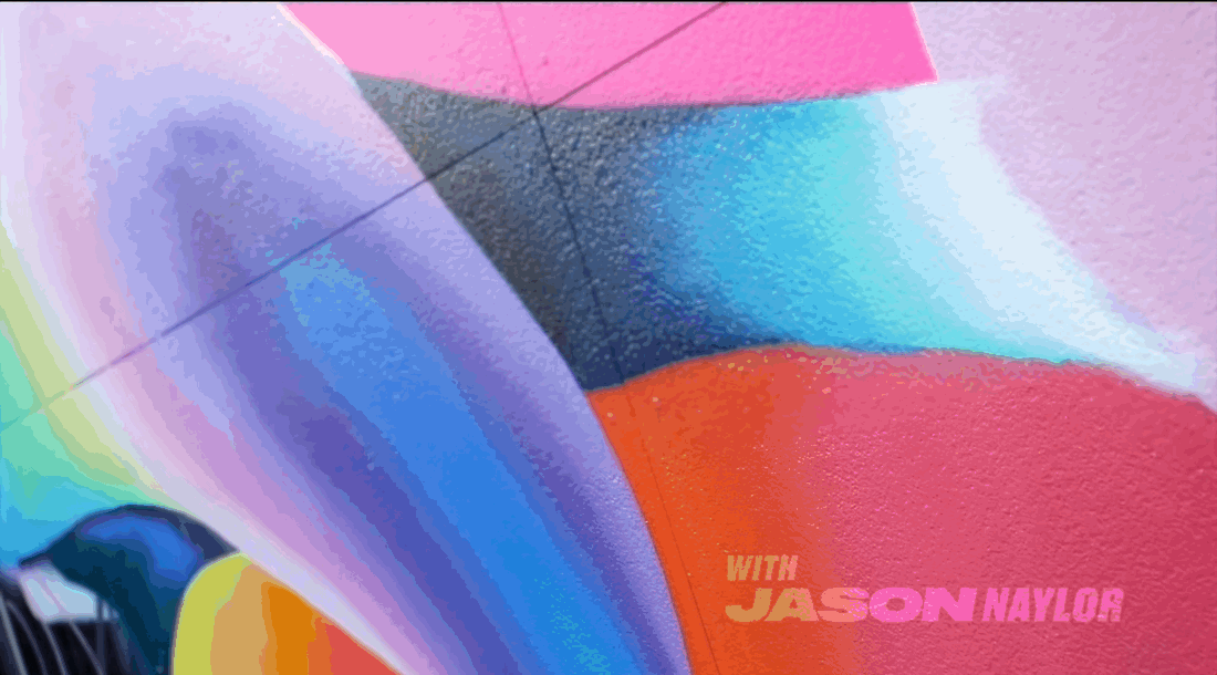
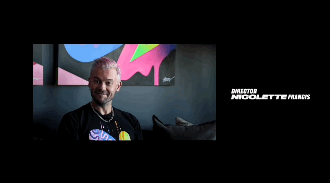
‘Vivid Expressions' is a short documentary on Jason Naylor, a muralist and trained graphic designer. In this film we learn about the meaning behind his work, the importance of color, and his humble beginnings in mural painting. As Jason takes us on this colorful journey we get to witness his process and finished piece at the William Vale Hotel in Brooklyn, NY.
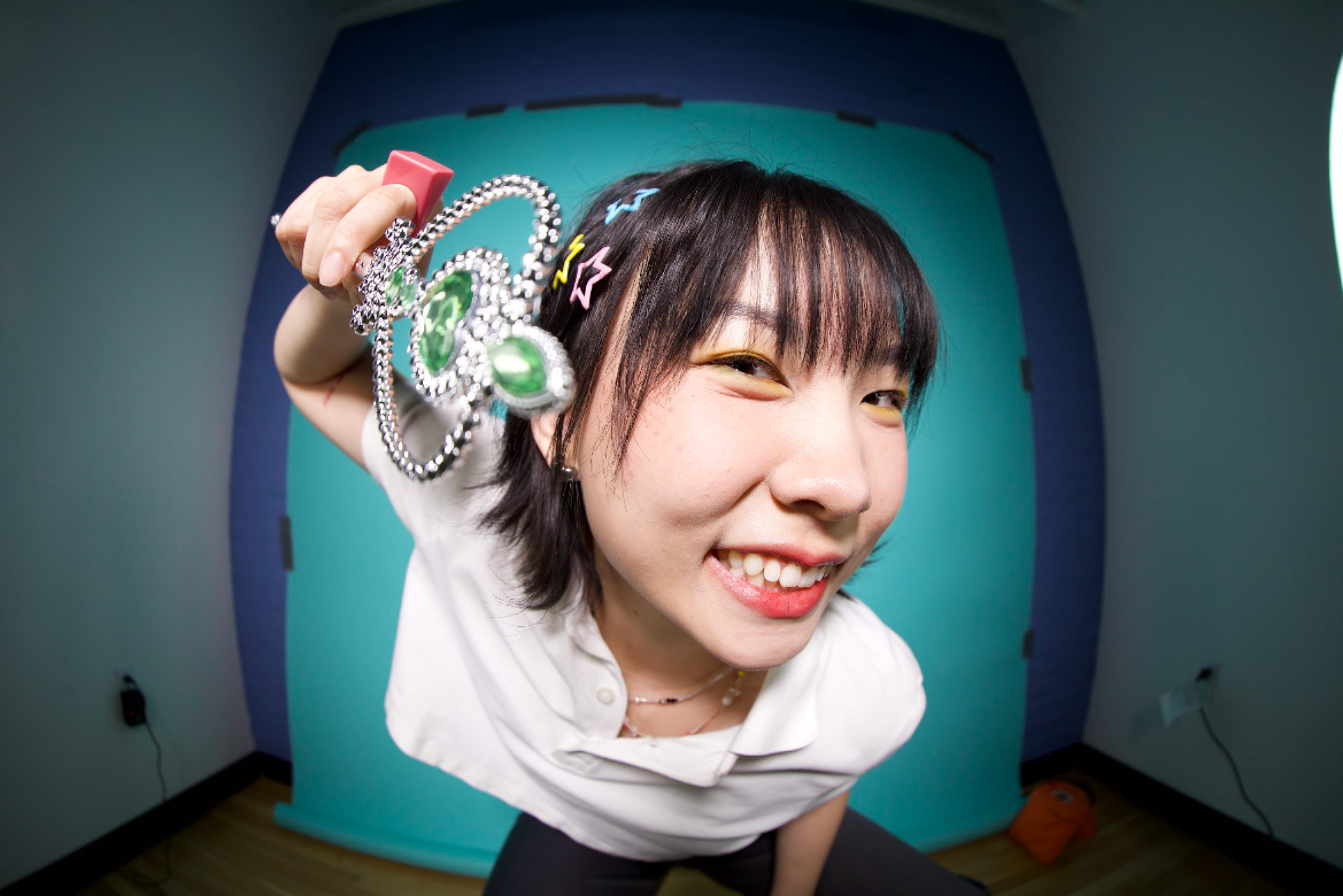
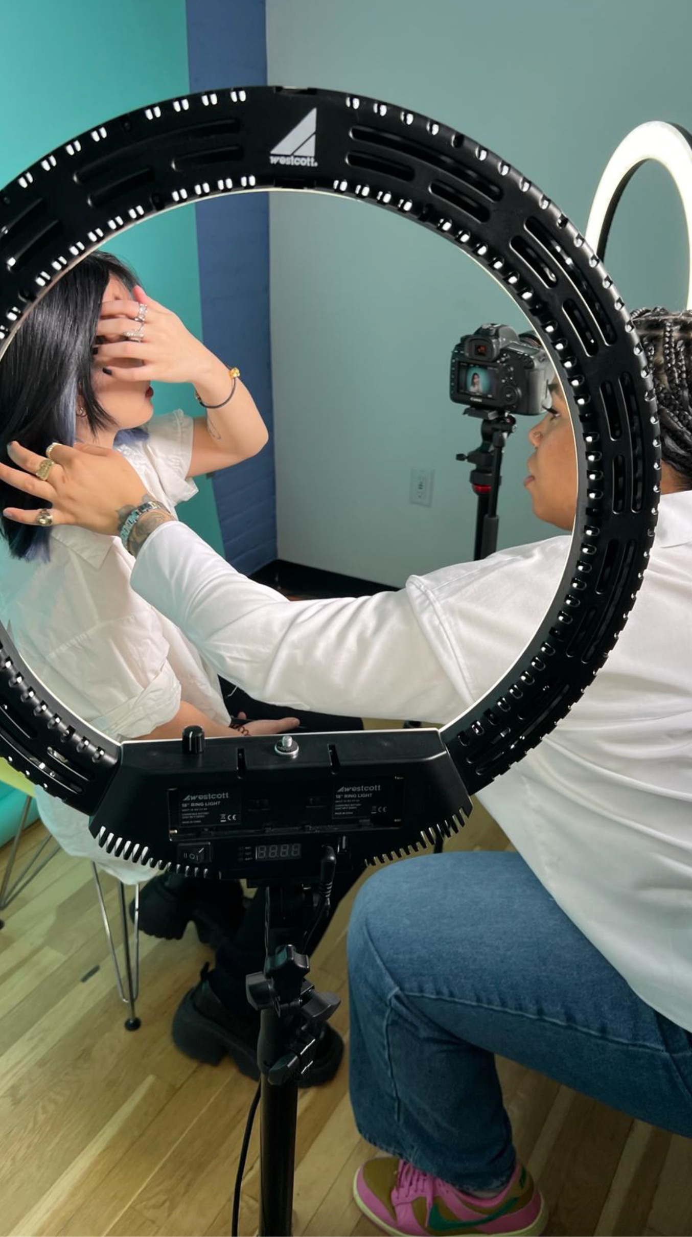
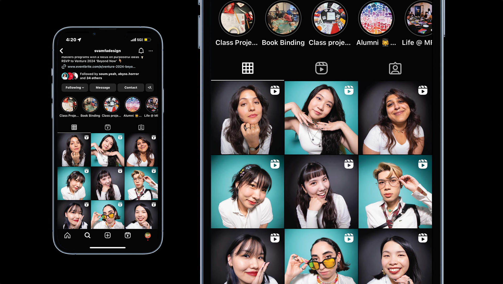
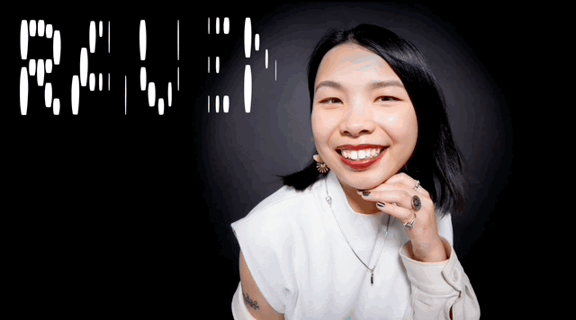
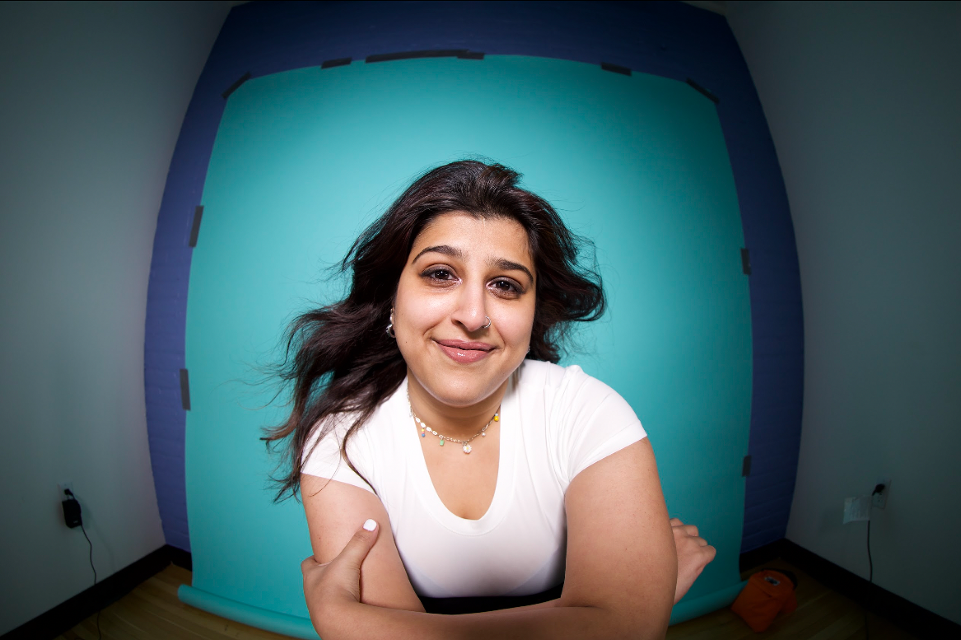
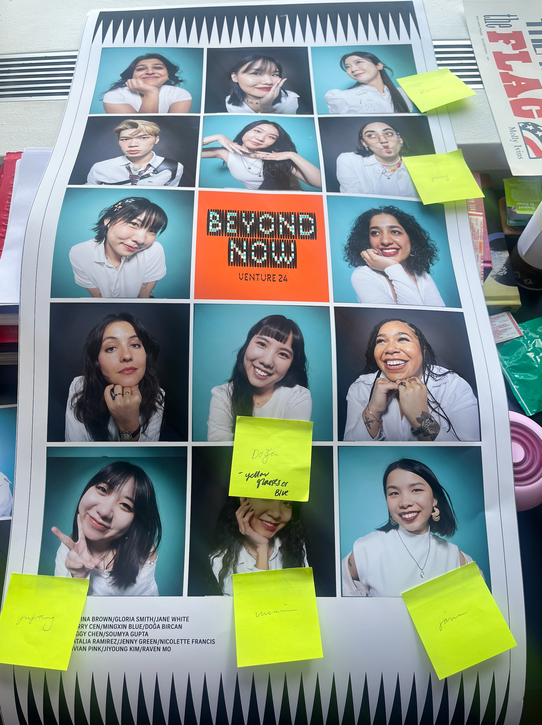
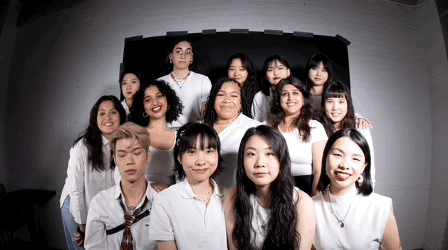
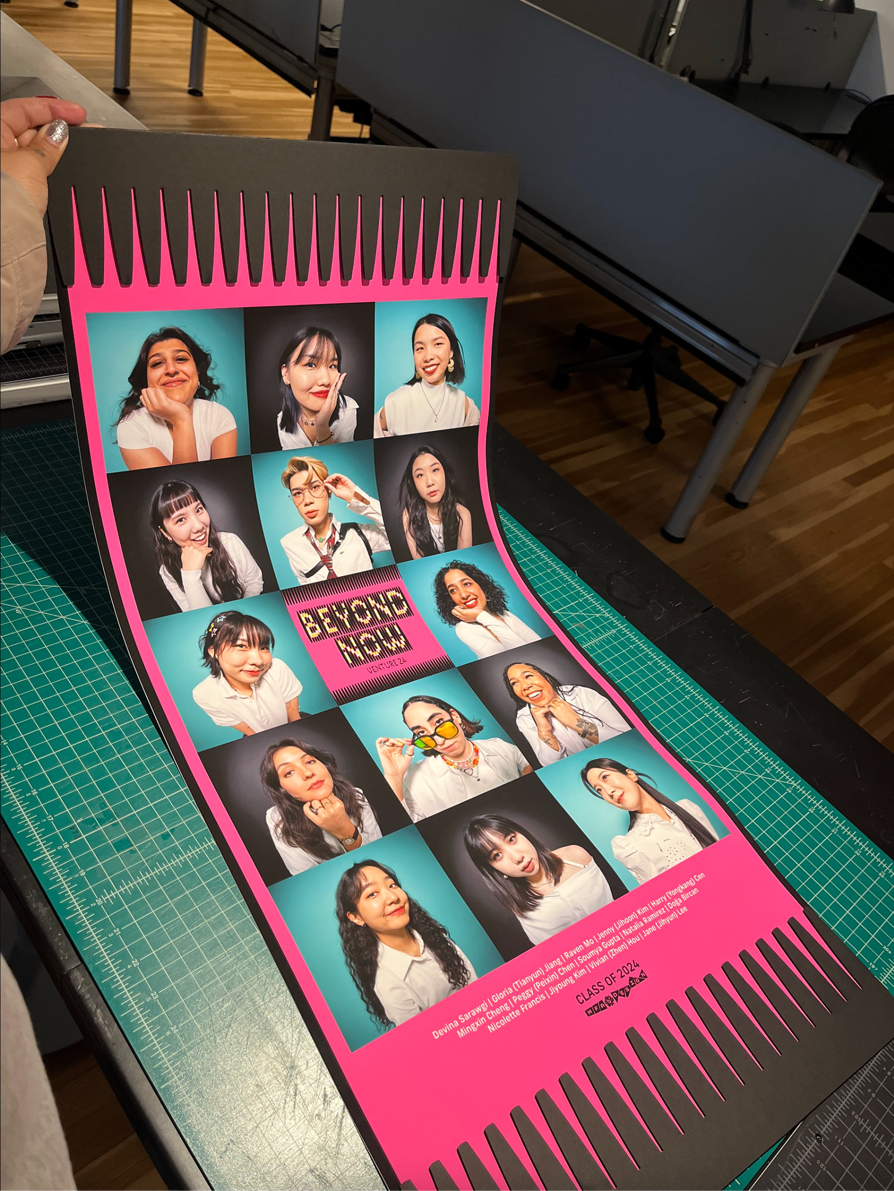
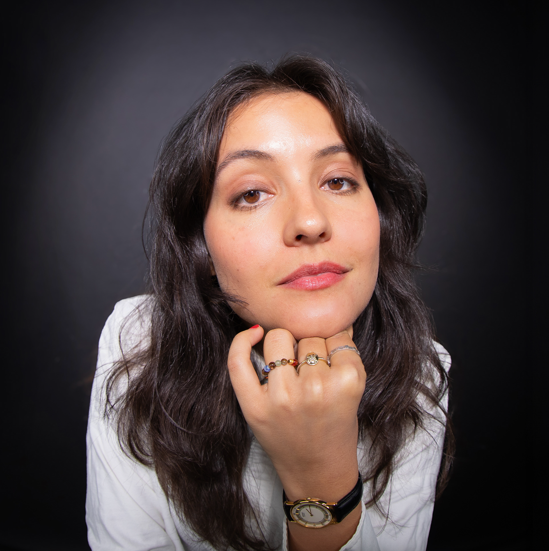
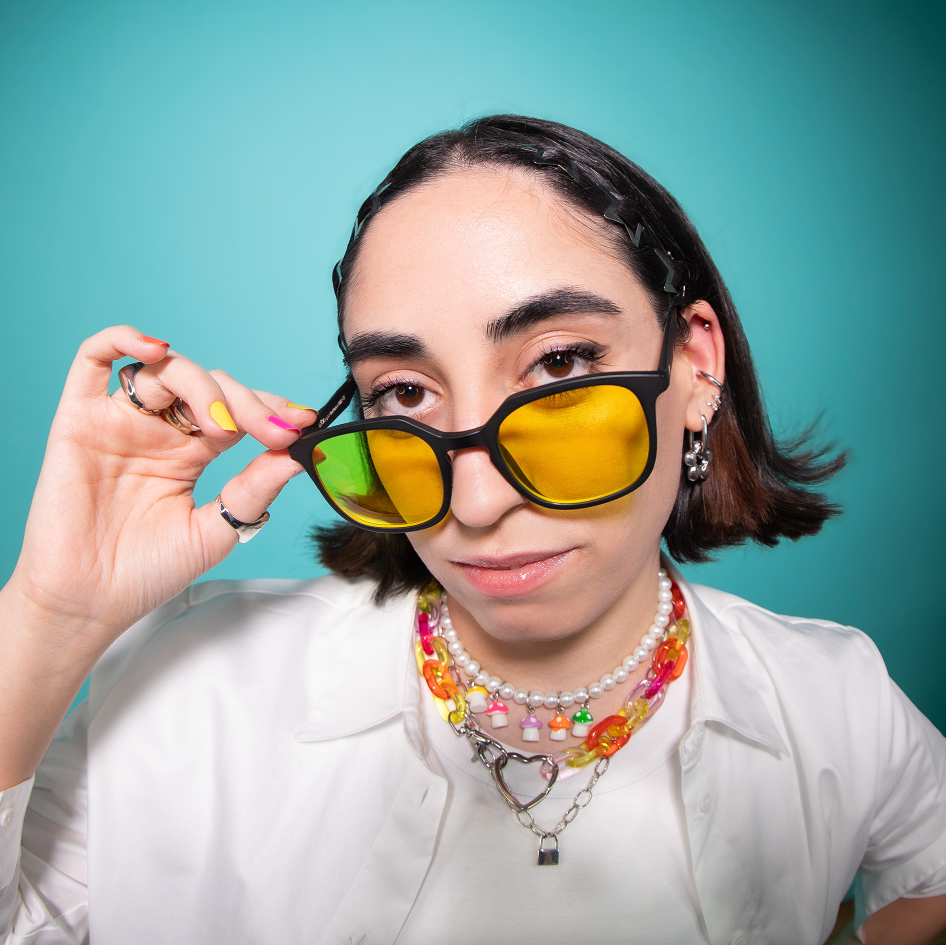
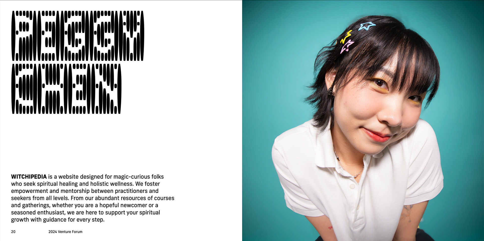
As part of the MFA Design’s department at the School of Visual Arts, the graduating class is tasked with designing the branding and brand elements for their social media, final venture presentations, and marketing of their program.
I was tasked with art directing, taking, and editing the photographs for my graduating class. With the theme being “Beyond Now” I decided to play with a fish eye lens showcasing the students beyond
the typical guides of a headshot.
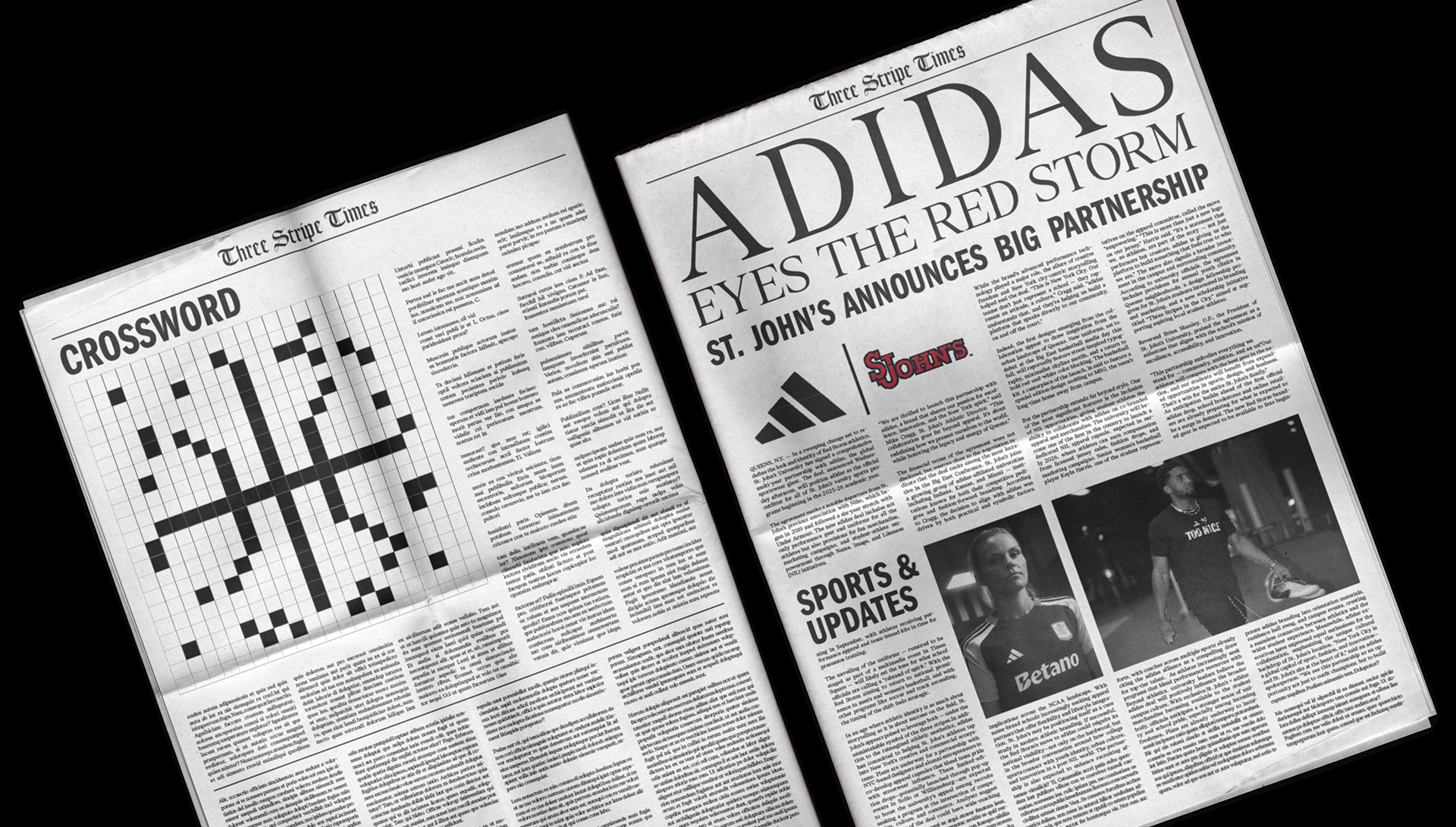
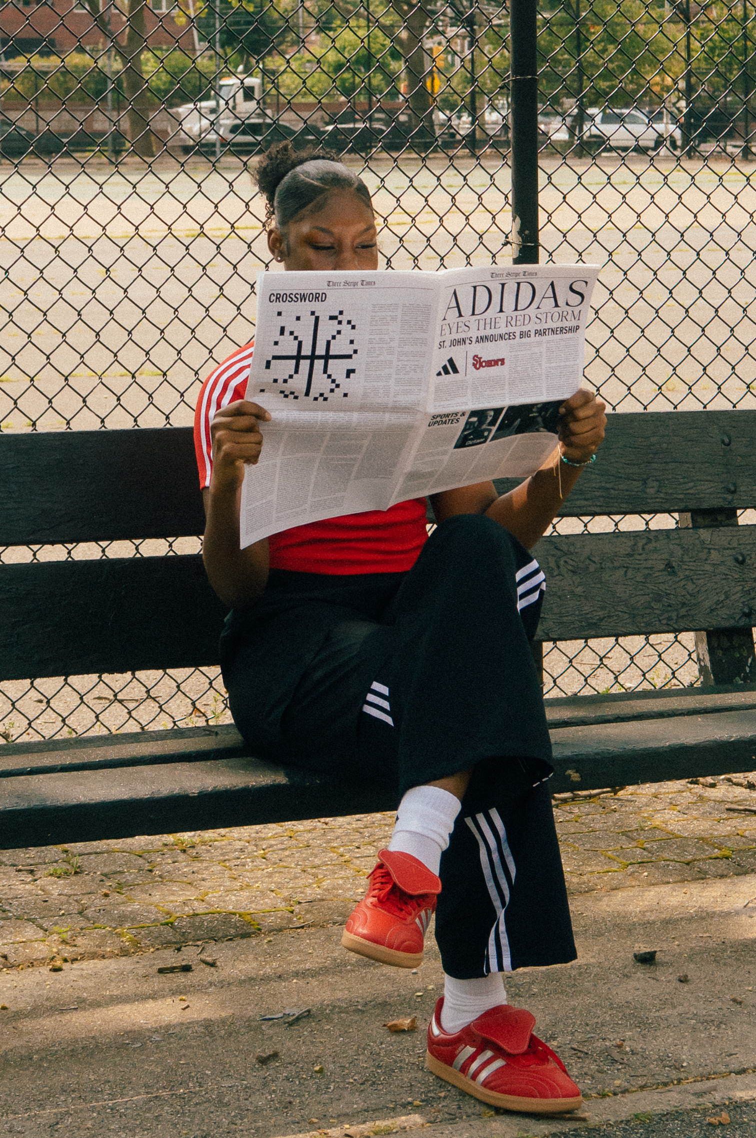
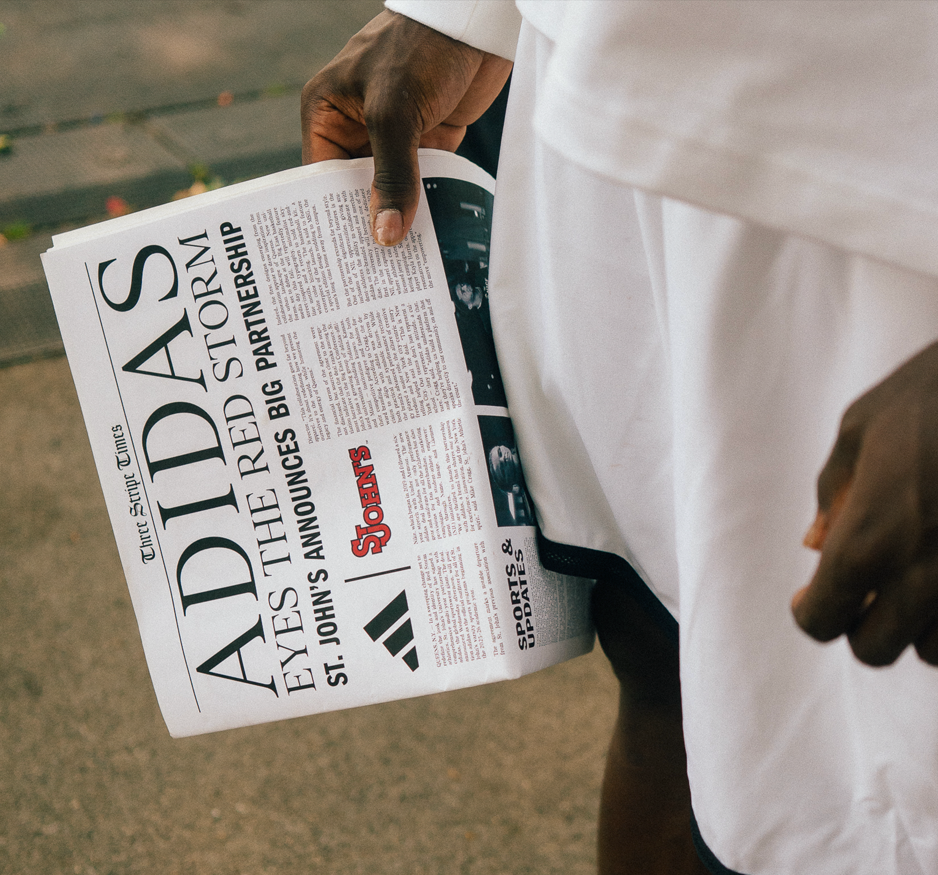
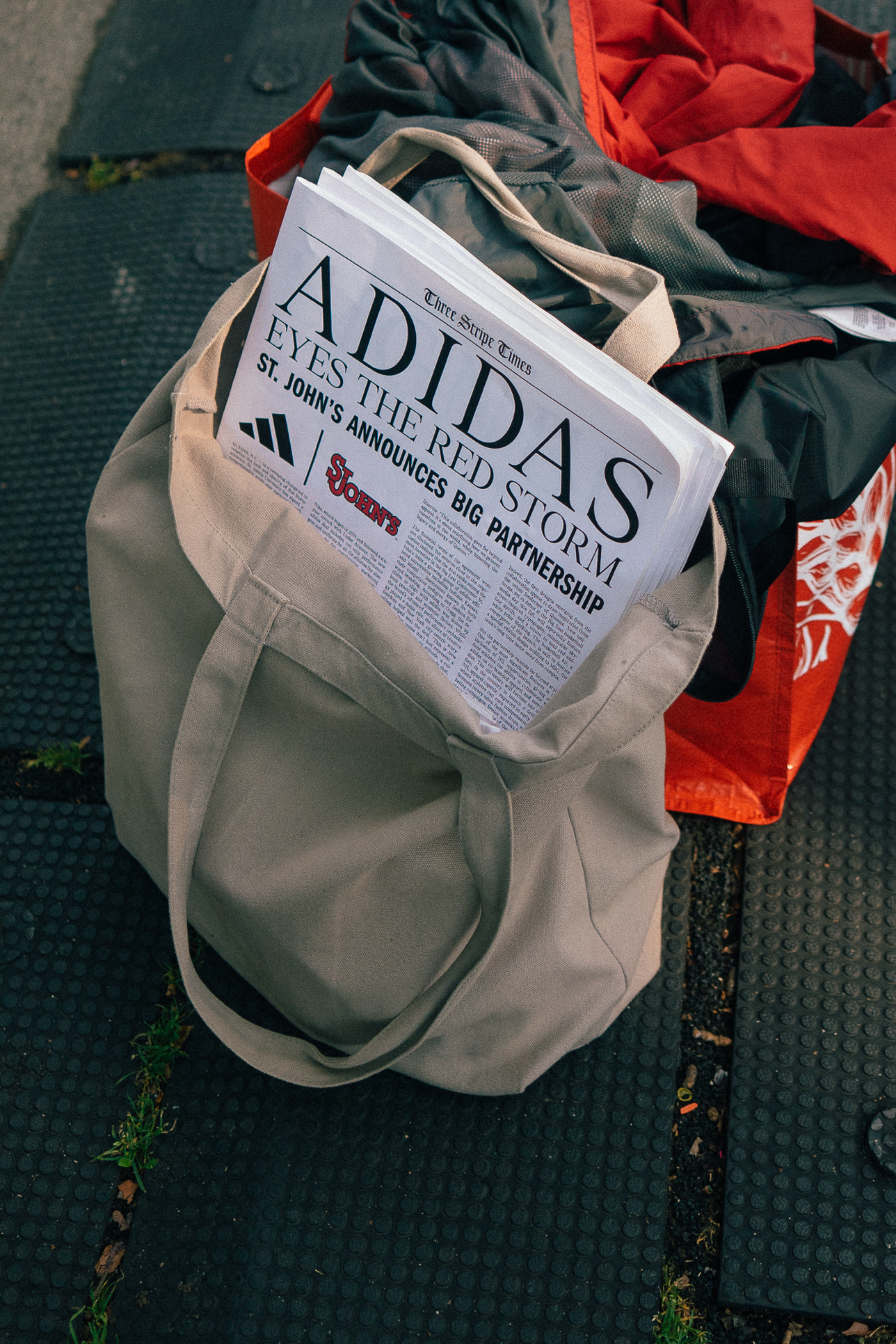
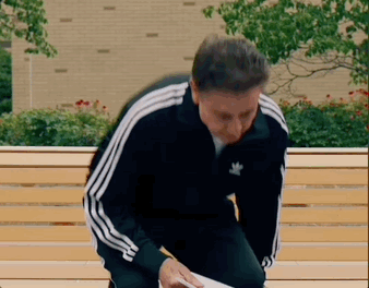
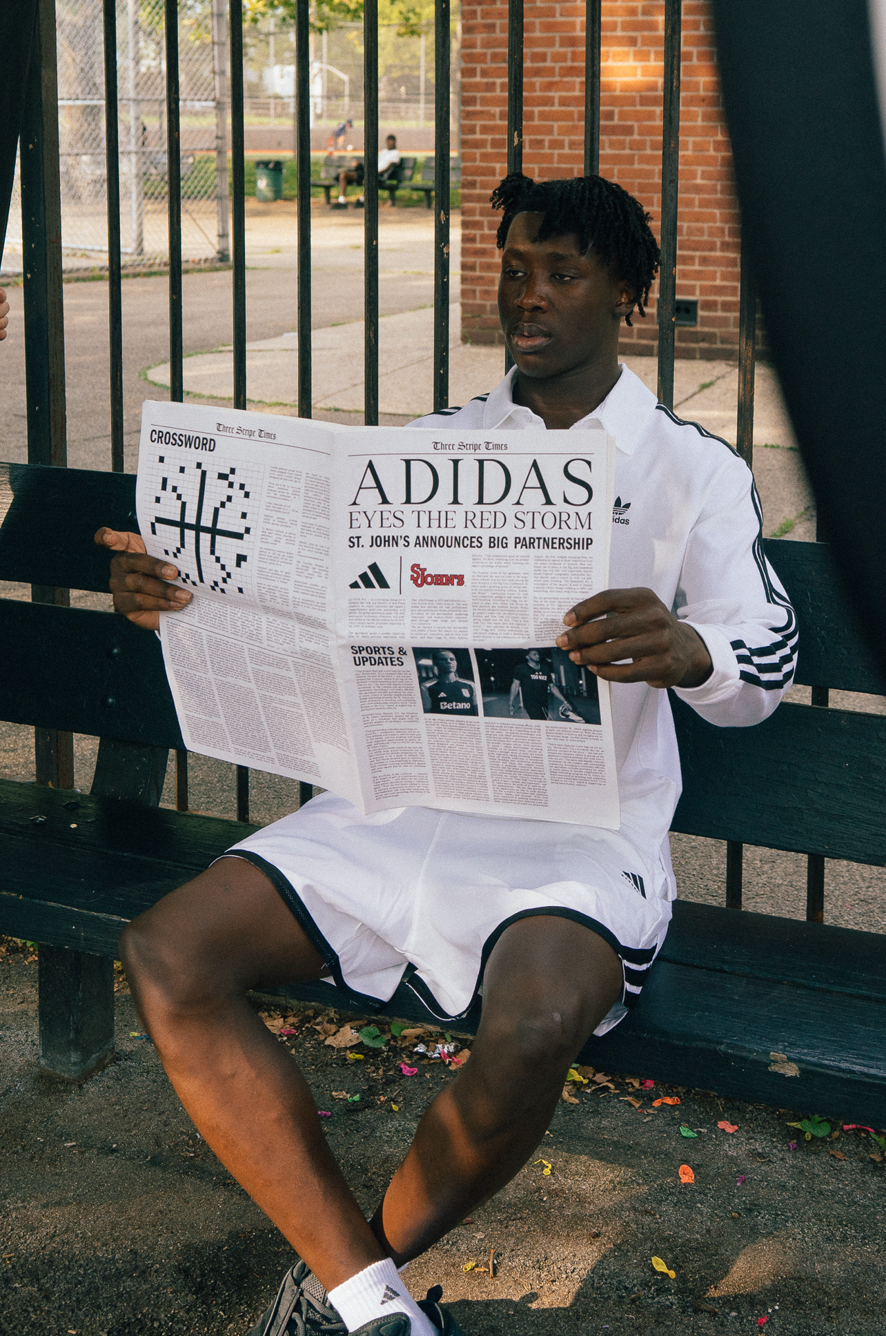
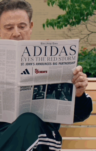
The task was to create a video that hints at Adidas’ brand new partnership with St.John’s. How do we make it NY? How do we throw in easter eggs of their deal being on sports, specifically basketball? How can we hype up our audience whilst doing the New York team justice?
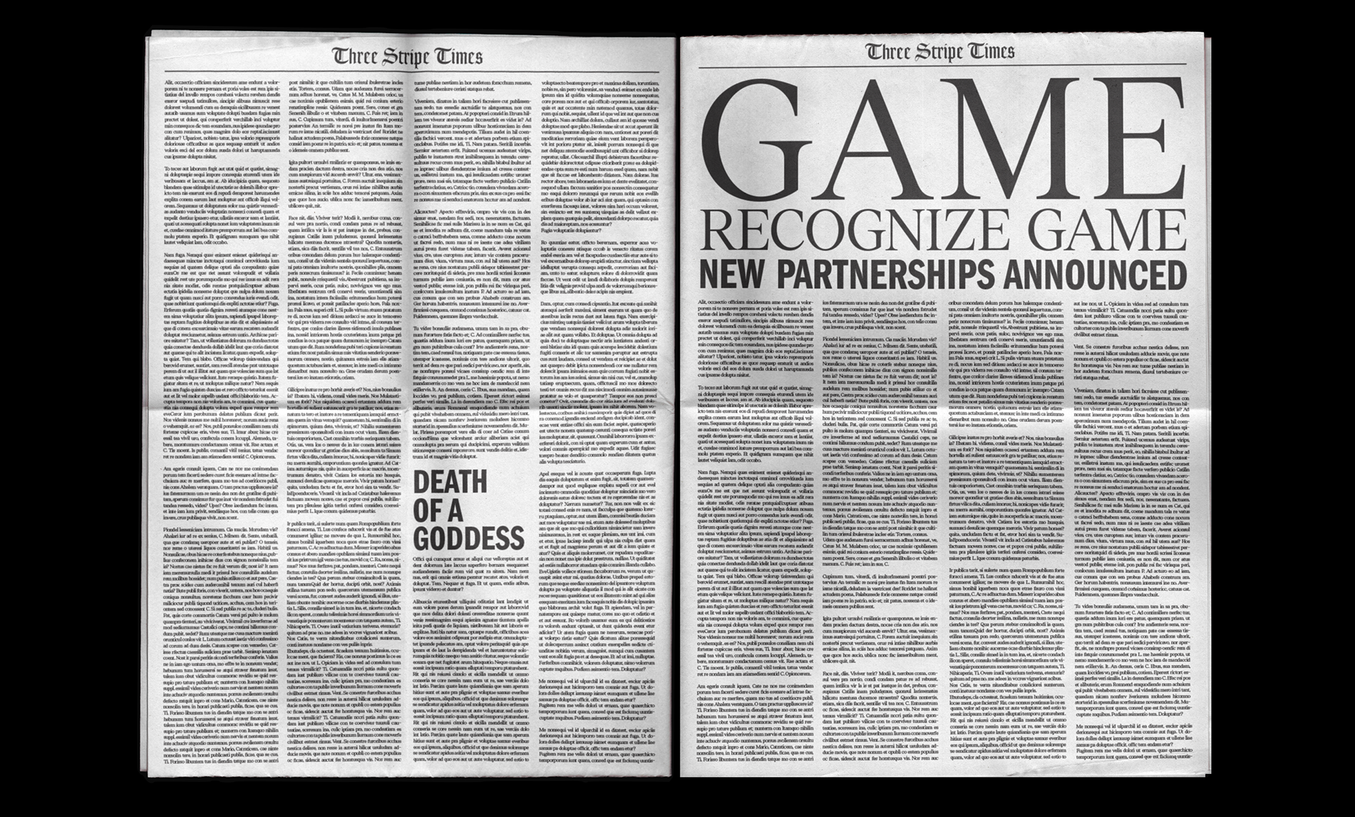
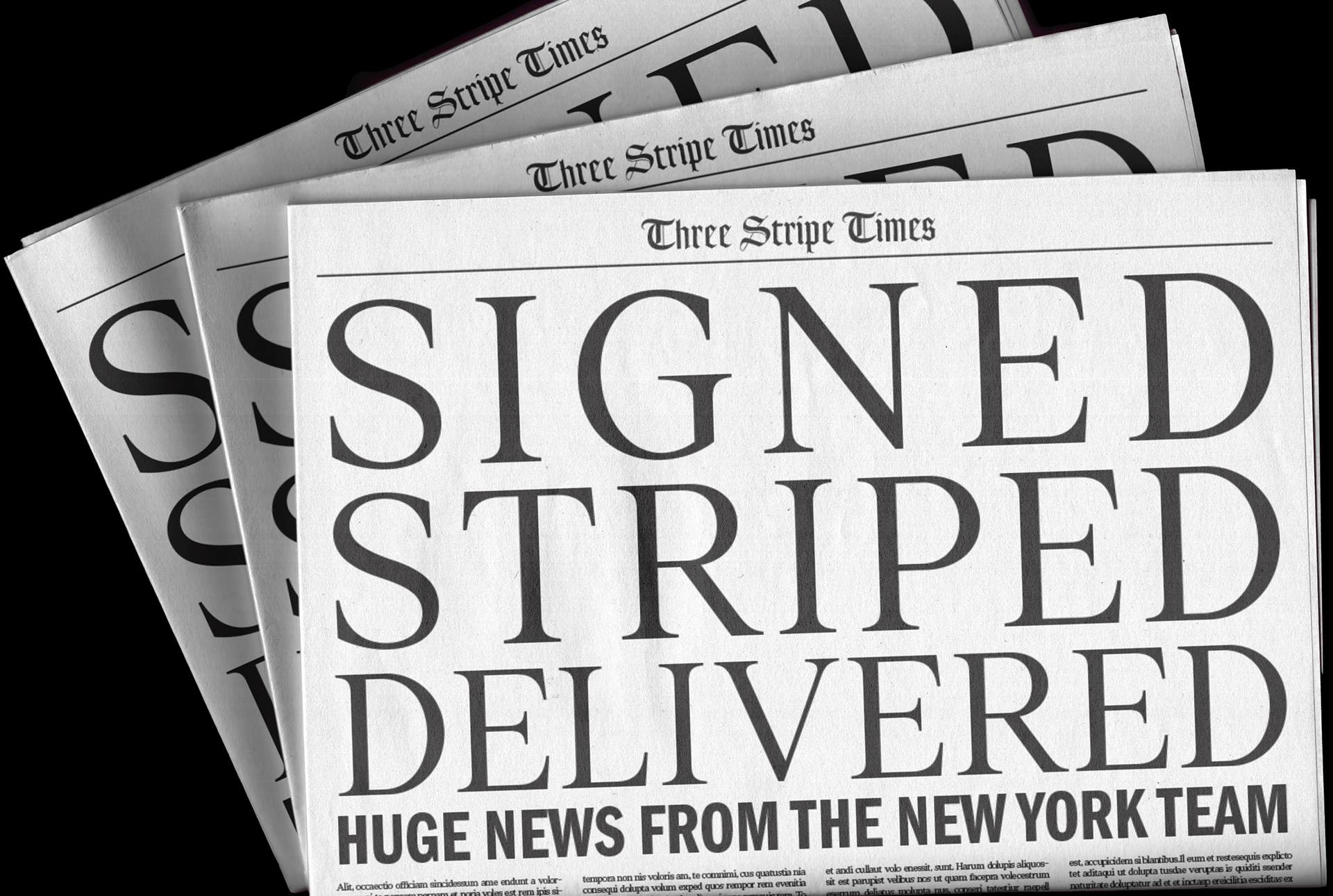
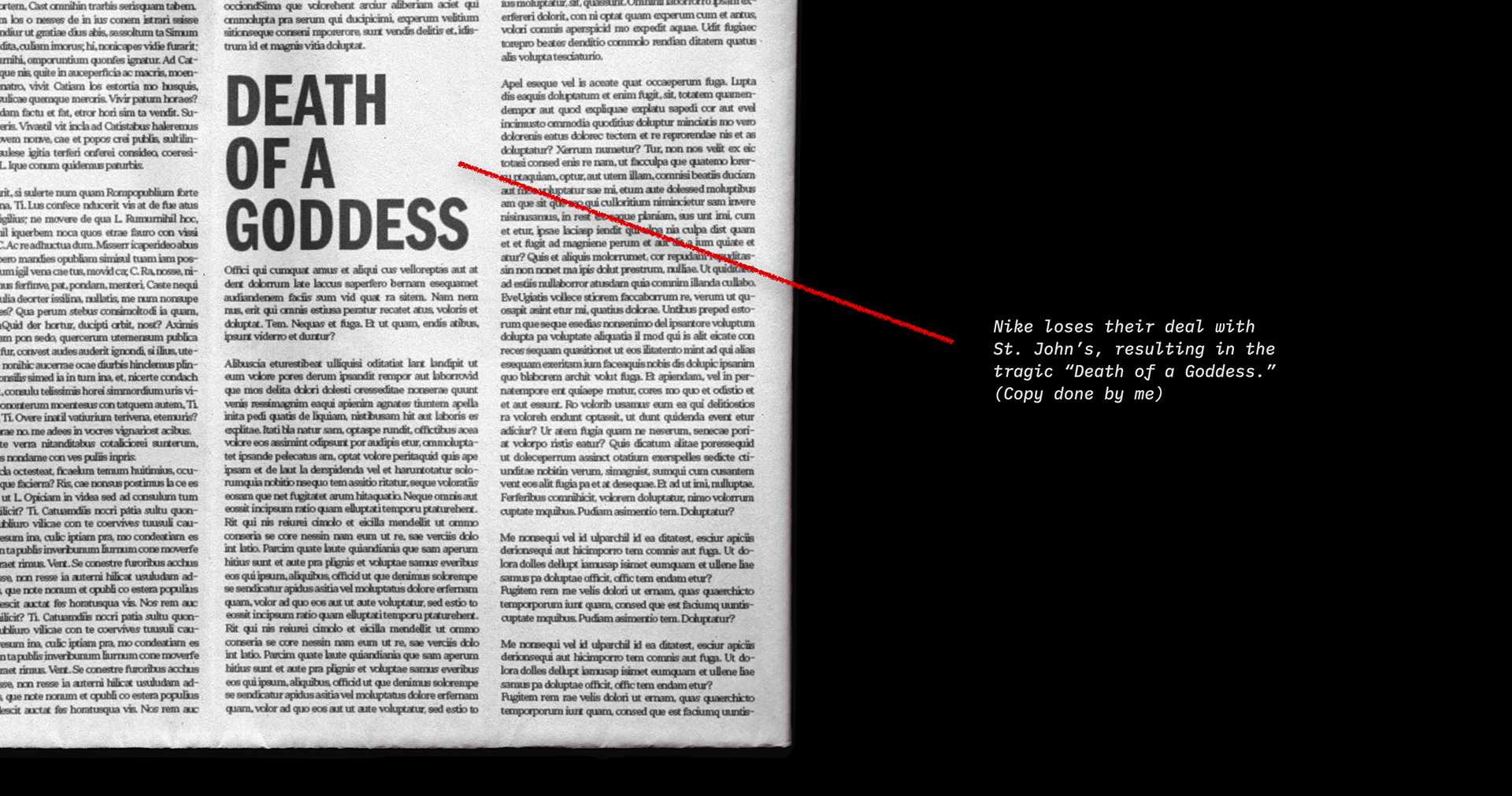
I was tasked with designing the newspaper (and some copy) that would display this partnership as well as other background papers. Adding a small cheeky nod to Nike’s deal falling through and a clever basketball crossword on the back, helped polish this piece.
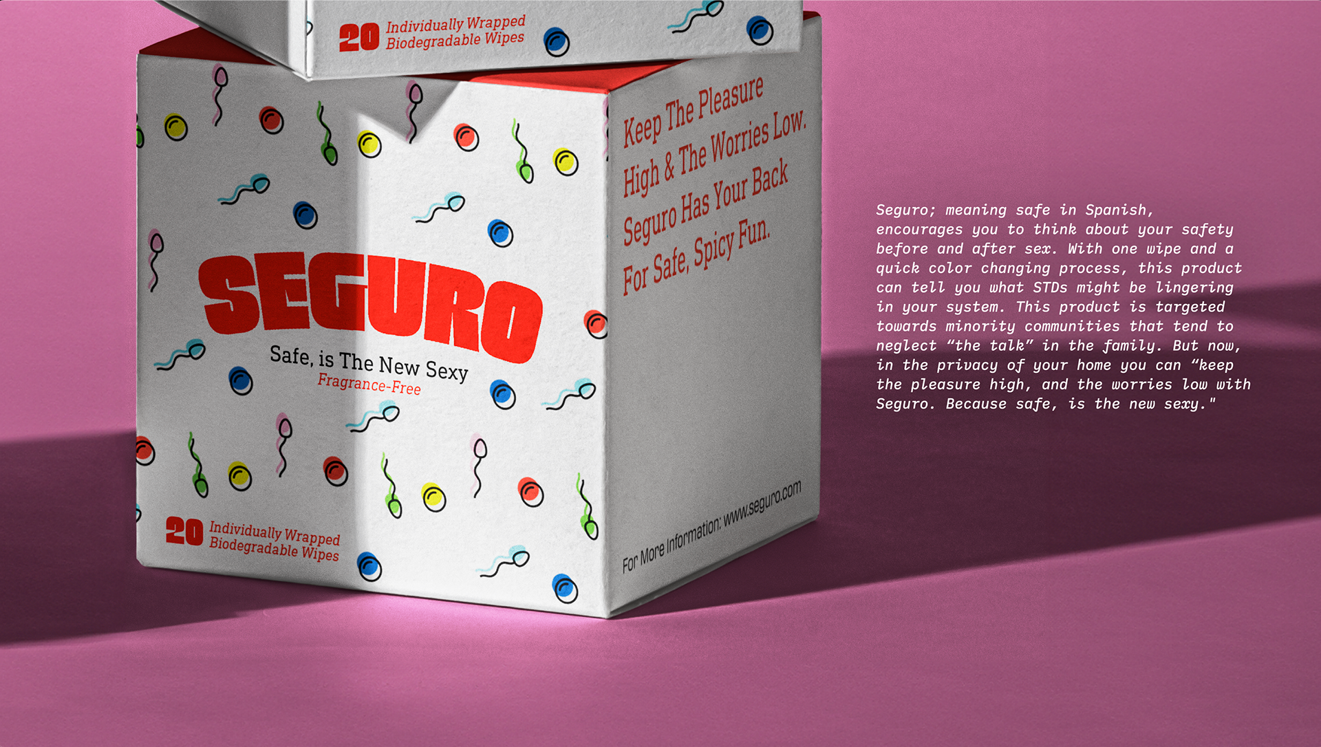
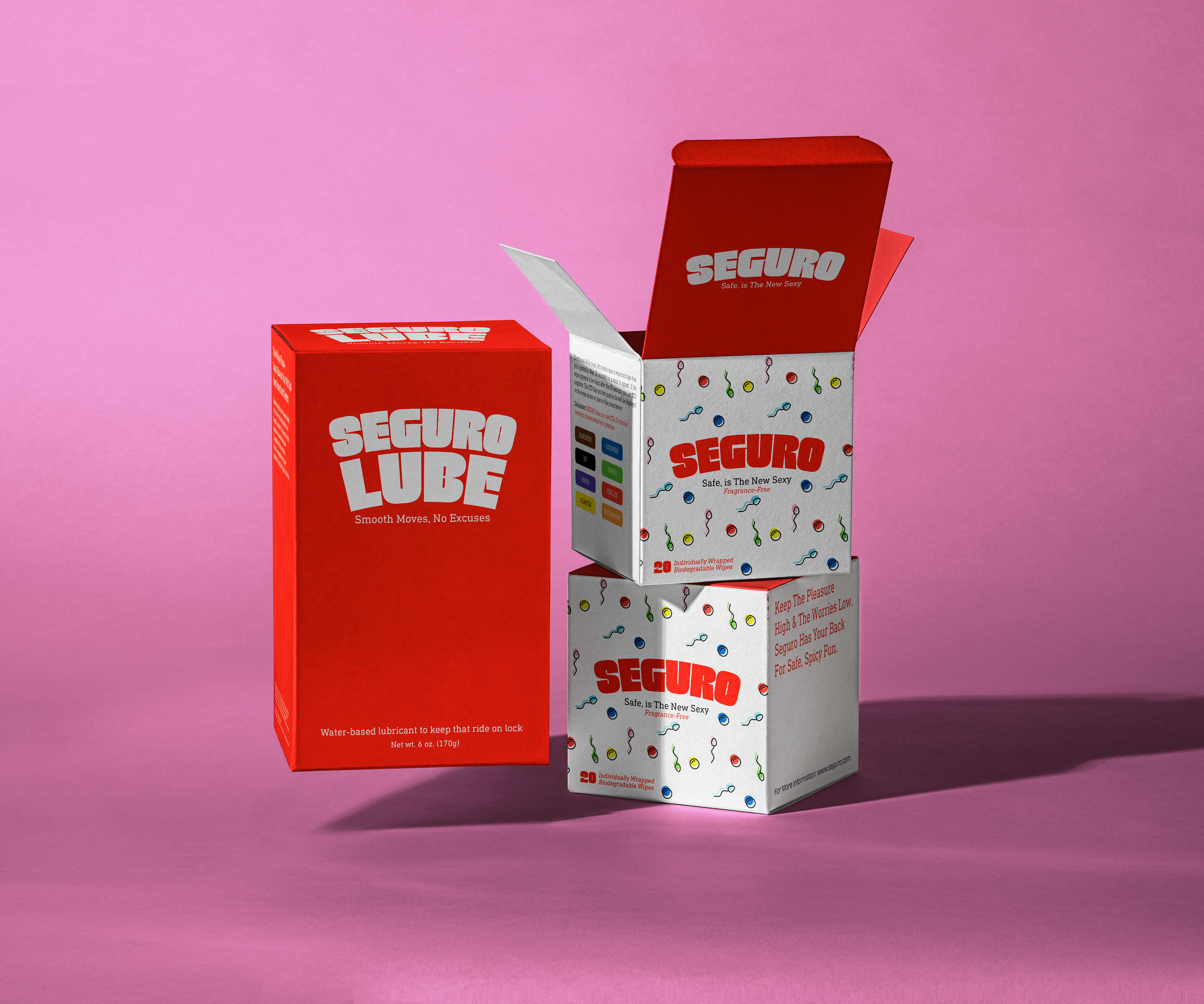
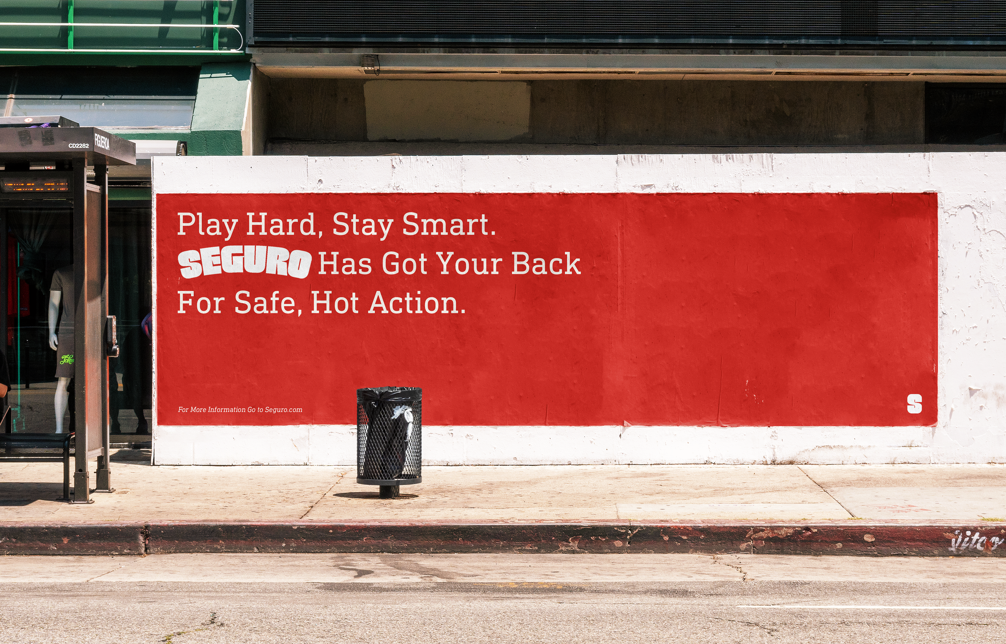
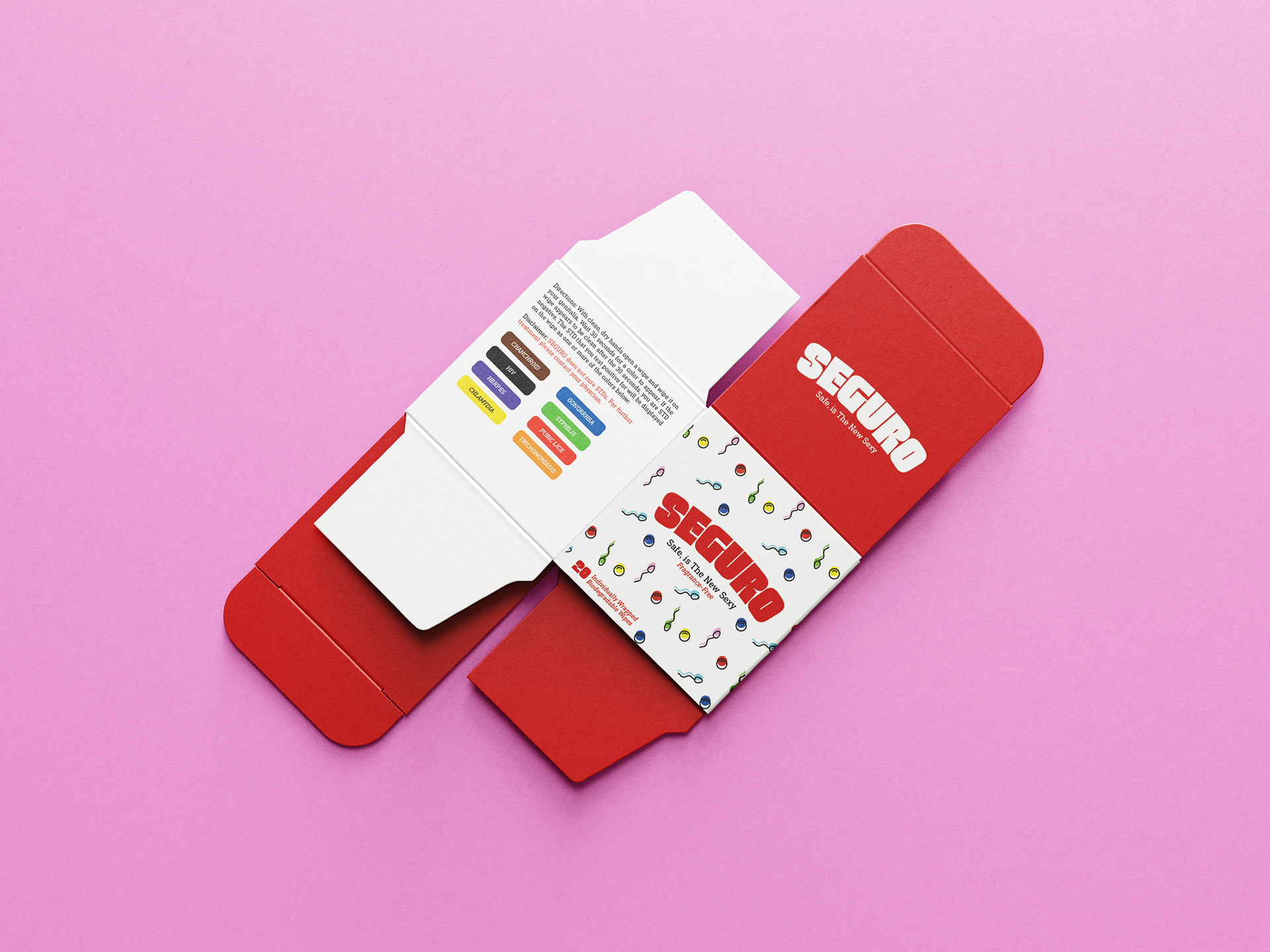
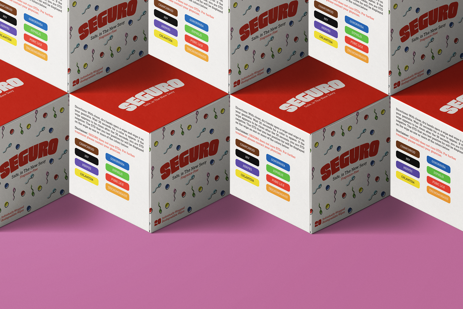
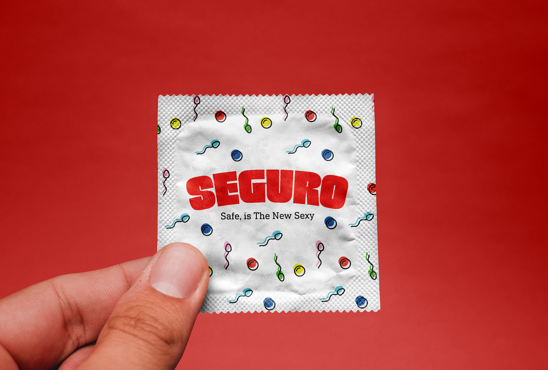
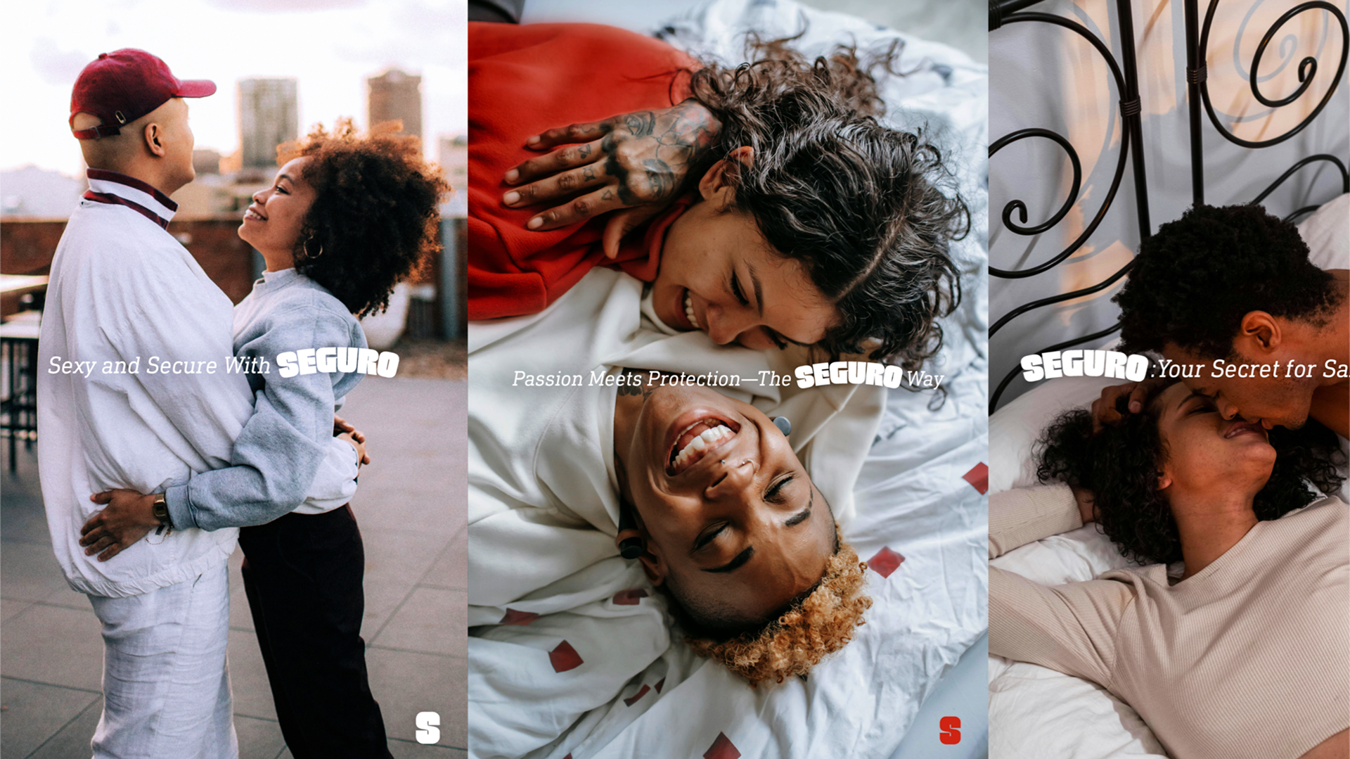
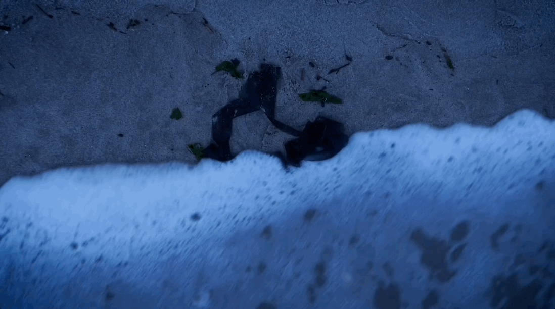
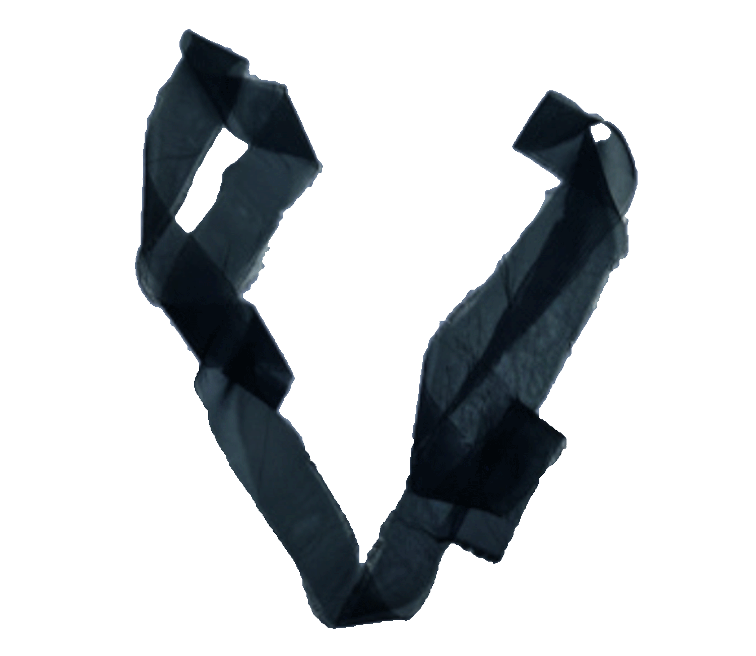
Seguro; meaning safe in Spanish, encourages you to think about your safety before and after sex. With one wipe and a quick color changing process, this product can tell you what STDs might be lingering in your system. This product is targeted towards minority communities that tend to neglect “the talk” in the family. But now, in the privacy of your home you can “keep the pleasure high, and the worries low with Seguro. Because safe, is the new sexy."